README

Google Map React Component Tutorial 
A declarative Google Map React component using React, lazy-loading dependencies, current-location finder and a test-driven approach by the Fullstack React team.
See the demo and accompanying blog post.
Quickstart
First, install the library:
npm install --save google-maps-react
Automatically Lazy-loading Google API
The library includes a helper to wrap around the Google maps API. The GoogleApiWrapper Higher-Order component accepts a configuration object which must include an apiKey. See lib/GoogleApi.js for all options it accepts.
import {GoogleApiWrapper} from 'google-maps-react';

// ...

export class MapContainer extends React.Component {}

export default GoogleApiWrapper({
  apiKey: (YOUR_GOOGLE_API_KEY_GOES_HERE)
})(MapContainer)
Alternatively, the GoogleApiWrapper Higher-Order component can be configured by passing a function that will be called with whe wrapped component's props and should returned the configuration object.
export default GoogleApiWrapper(
  (props) => ({
    apiKey: props.apiKey,
    language: props.language,
  }
))(MapContainer)
If you want to add a loading container other than the default loading container, simply pass it in the HOC, like so:
const LoadingContainer = (props) => (
  <div>Fancy loading container!</div>
)

export default GoogleApiWrapper({
  apiKey: (YOUR_GOOGLE_API_KEY_GOES_HERE),
  LoadingContainer: LoadingContainer
})(MapContainer)
Sample Usage With Lazy-loading Google API:
import {Map, InfoWindow, Marker, GoogleApiWrapper} from 'google-maps-react';

export class MapContainer extends Component {
  render() {
    return (
      <Map google={this.props.google} zoom={14}>

        <Marker onClick={this.onMarkerClick}
                name={'Current location'} />

        <InfoWindow onClose={this.onInfoWindowClose}>
            <div>
              <h1>{this.state.selectedPlace.name}</h1>
            </div>
        </InfoWindow>
      </Map>
    );
  }
}

export default GoogleApiWrapper({
  apiKey: (YOUR_GOOGLE_API_KEY_GOES_HERE)
})(MapContainer)
Note: Marker and InfoWindow components are disscussed below.

Examples
Check out the example site at: http://fullstackreact.github.io/google-maps-react
Additional Map Props
The Map component takes a number of optional props.
Zoom: (Shown Above) takes a number with the higher value representing a tighter focus on the map's center.
Style: Takes CSS style object - commonly width and height.
const style = {
  width: '100%',
  height: '100%'
}
Container Style: Takes CSS style object - optional, commonly when you want to change from the default of position "absolute".
const containerStyle = {
  position: 'relative',
  width: '100%',
  height: '100%'
}
    <Map
          containerStyle={containerStyle}
initialCenter: Takes an object containing latitude and longitude coordinates. Sets the maps center upon loading.
    <Map
          google={this.props.google}
          style={style}
          initialCenter={{
            lat: 40.854885,
            lng: -88.081807
          }}
          zoom={15}
          onClick={this.onMapClicked}
        >
center: Takes an object containing latitude and longitude coordinates. Use this if you want to re-render the map after the initial render.
    <Map
          google={this.props.google}
          style={style}
          center={{
            lat: 40.854885,
            lng: -88.081807
          }}
          zoom={15}
          onClick={this.onMapClicked}
        >
bounds: Takes a google.maps.LatLngBounds() object to adjust the center and zoom of the map.
var points = [
    { lat: 42.02, lng: -77.01 },
    { lat: 42.03, lng: -77.02 },
    { lat: 41.03, lng: -77.04 },
    { lat: 42.05, lng: -77.02 }
]
var bounds = new this.props.google.maps.LatLngBounds();
for (var i = 0; i < points.length; i++) {
  bounds.extend(points[i]);
}
return (
    <Map
        google={this.props.google}
        initialCenter={{
            lat: 42.39,
            lng: -72.52
        }}
        bounds={bounds}>
    </Map>
);
The following props are boolean values for map behavior:
scrollwheel, draggable, keyboardShortcuts, disableDoubleClickZoom
The following props are boolean values for presence of controls on the map:
zoomControl, mapTypeControl, scaleControl, streetViewControl, panControl, rotateControl, fullscreenControl
The following props are object values for control options such as placement of controls on the map:
zoomControlOptions, mapTypeControlOptions, streetViewControlOptions
See Google Maps Controls for more information.
It also takes event handlers described below:
Events
The <Map /> component handles events out of the box. All event handlers are optional.
onReady
When the <Map /> instance has been loaded and is ready on the page, it will call the onReady prop, if given. The onReady prop is useful for fetching places or using the autocomplete API for places.
fetchPlaces(mapProps, map) {
  const {google} = mapProps;
  const service = new google.maps.places.PlacesService(map);
  // ...
}

render() {
  return (
    <Map google={this.props.google}
      onReady={this.fetchPlaces}
      visible={false}>
        <Listing places={this.state.places} />
    </Map>
  )
}
onClick
To listen for clicks on the <Map /> component, pass the onClick prop:
mapClicked(mapProps, map, clickEvent) {
  // ...
}

render() {
  return (
    <Map google={this.props.google}
      onClick={this.mapClicked} />
  )
}
onDragend
When our user changes the map center by dragging the Map around, we can get a callback after the event is fired with the onDragend prop:
centerMoved(mapProps, map) {
  // ...
}

render() {
  return (
    <Map google={this.props.google}
      onDragend={this.centerMoved} />
  )
}
The <Map /> component also listens to onRecenter, onBounds_changed, onCenter_changed, onDblclick, onDragstart, onHeading_change, onIdle, onMaptypeid_changed, onMousemove, onMouseout, onMouseover, onProjection_changed, onResize, onRightclick, onTilesloaded, onTilt_changed, and onZoom_changed events. See Google Maps Events for more information.
Visibility
You can control the visibility of the map by using the visible prop. This is useful for situations when you want to use the Google Maps API without a map. The <Map /> component will load like normal. See the Google places demo
For example:
<Map google={this.props.google}
    visible={false}>
  <Listing places={this.state.places} />
</Map>
Subcomponents
The <Map /> api includes subcomponents intended on being used as children of the Map component. Any child can be used within the Map component and will receive the three props (as children):
map- the Google instance of themapgoogle- a reference to thewindow.googleobjectmapCenter- thegoogle.maps.LatLng()object referring to the center of the map instance
Marker
To place a marker on the Map, include it as a child of the <Map /> component.
<Map google={this.props.google}
    style={{width: '100%', height: '100%', position: 'relative'}}
    className={'map'}
    zoom={14}>
  <Marker
    title={'The marker`s title will appear as a tooltip.'}
    name={'SOMA'}
    position={{lat: 37.778519, lng: -122.405640}} />
  <Marker
    name={'Dolores park'}
    position={{lat: 37.759703, lng: -122.428093}} />
  <Marker />
  <Marker
    name={'Your position'}
    position={{lat: 37.762391, lng: -122.439192}}
    icon={{
      url: "/path/to/custom_icon.png",
      anchor: new google.maps.Point(32,32),
      scaledSize: new google.maps.Size(64,64)
    }} />
</Map>
The <Marker /> component accepts a position prop that defines the location for the position on the map. It can be either a raw object or a google.maps.LatLng() instance.
If no position is passed in the props, the marker will default to the current position of the map, i.e. the mapCenter prop.
You can also pass any other props you want with the <Marker />. It will be passed back through marker events.
The marker component can also accept a child InfoMarker component for situations where there is only 1 marker and 1 infowindow.
<Marker
  title="Location"
  id={1}
  position={markerCenter}
  draggable={true}
  onDragend={this.moveMarker.bind(this)}
  >
  <InfoWindow
    visible={showInfoWindow}
    style={styles.infoWindow}
    >
      <div className={classes.infoWindow}>
        <p>Click on the map or drag the marker to select location where the incident occurred</p>
      </div>
  </InfoWindow>
</Marker>
Events
The <Marker /> component listens for events, similar to the <Map /> component.
onClick
You can listen for an onClick event with the (appropriately named) onClick prop.
onMarkerClick(props, marker, e) {
  // ..
}

render() {
  return (
    <Map google={this.props.google}>
      <Marker onClick={this.onMarkerClick}
          name={'Current location'} />
    </Map>
  )
}
mouseover
You can also pass a callback when the user mouses over a <Marker /> instance by passing the onMouseover callback:
onMouseoverMarker(props, marker, e) {
  // ..
}

render() {
  return (
    <Map google={this.props.google}>
      <Marker onMouseover={this.onMouseoverMarker}
          name={'Current location'} />
    </Map>
  )
}
Polygon
To place a polygon on the Map, set <Polygon /> as child of Map component.
render() {
  const triangleCoords = [
    {lat: 25.774, lng: -80.190},
    {lat: 18.466, lng: -66.118},
    {lat: 32.321, lng: -64.757},
    {lat: 25.774, lng: -80.190}
  ];

  return(
    <Map google={this.props.google}
        style={{width: '100%', height: '100%', position: 'relative'}}
        className={'map'}
        zoom={14}>
        <Polygon
          paths={triangleCoords}
          strokeColor="#0000FF"
          strokeOpacity={0.8}
          strokeWeight={2}
          fillColor="#0000FF"
          fillOpacity={0.35} />
    </Map>
  )
}
Events
The <Polygon /> component listens to onClick, onMouseover and onMouseout events.
Polyline
To place a polyline on the Map, set <Polyline /> as child of Map component.
render() {
  const triangleCoords = [
    {lat: 25.774, lng: -80.190},
    {lat: 18.466, lng: -66.118},
    {lat: 32.321, lng: -64.757},
    {lat: 25.774, lng: -80.190}
  ];

  return(
    <Map google={this.props.google}
        style={{width: '100%', height: '100%', position: 'relative'}}
        className={'map'}
        zoom={14}>
        <Polyline
          path={triangleCoords}
          strokeColor="#0000FF"
          strokeOpacity={0.8}
          strokeWeight={2} />
    </Map>
  )
}
Events
The <Polyline /> component listens to onClick, onMouseover and onMouseout events.
InfoWindow
The <InfoWindow /> component included in this library is gives us the ability to pop up a "more info" window on our Google map.

The visibility of the <InfoWindow /> component is controlled by a visible prop. The visible prop is a boolean (PropTypes.bool) that shows the <InfoWindow /> when true and hides it when false.
There are two ways how to control a position of the <InfoWindow /> component.
You can use a position prop or connect the <InfoWindow /> component directly to an existing <Marker /> component by using a marker prop.
//note: code formatted for ES6 here
export class MapContainer extends Component {
  state = {
    showingInfoWindow: false,
    activeMarker: {},
    selectedPlace: {},
  };

  onMarkerClick = (props, marker, e) =>
    this.setState({
      selectedPlace: props,
      activeMarker: marker,
      showingInfoWindow: true
    });

  onMapClicked = (props) => {
    if (this.state.showingInfoWindow) {
      this.setState({
        showingInfoWindow: false,
        activeMarker: null
      })
    }
  };

  render() {
    return (
      <Map google={this.props.google}
          onClick={this.onMapClicked}>
        <Marker onClick={this.onMarkerClick}
                name={'Current location'} />

        <InfoWindow
          marker={this.state.activeMarker}
          visible={this.state.showingInfoWindow}>
            <div>
              <h1>{this.state.selectedPlace.name}</h1>
            </div>
        </InfoWindow>
      </Map>
    )
  }
}
Events
The <InfoWindow /> throws events when it's showing/hiding. Every event is optional and can accept a handler to be called when the event is fired.
<InfoWindow
  onOpen={this.windowHasOpened}
  onClose={this.windowHasClosed}
  visible={this.state.showingInfoWindow}>
    <div>
      <h1>{this.state.selectedPlace.name}</h1>
    </div>
</InfoWindow>
onClose
The onClose event is fired when the <InfoWindow /> has been closed. It's useful for changing state in the parent component to keep track of the state of the <InfoWindow />.
onOpen
The onOpen event is fired when the window has been mounted in the Google map instance. It's useful for keeping track of the state of the <InfoWindow /> from within the parent component.
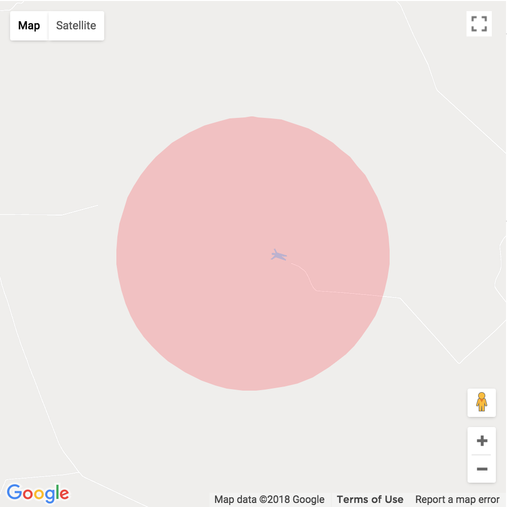
Circle

To place a circle on the Map, set <Circle /> as child of Map component.
render() {
  const coords = { lat: -21.805149, lng: -49.0921657 };

  return (
    <Map
      initialCenter={coords}
      google={this.props.google}
      style={{width: 500, height: 500, position: 'relative'}}
      zoom={14}
    >
      <Circle
        radius={1200}
        center={coords}
        onMouseover={() => console.log('mouseover')}
        onClick={() => console.log('click')}
        onMouseout={() => console.log('mouseout')}
        strokeColor='transparent'
        strokeOpacity={0}
        strokeWeight={5}
        fillColor='#FF0000'
        fillOpacity={0.2}
      />
    </Map>
  );
}
Events
The <Circle /> component listens to onClick, onMouseover and onMouseout events.
The GoogleApiWrapper automatically passes the google instance loaded when the component mounts (and will only load it once).
Custom Map Style
To set your own custom map style, import your custom map style in JSON format.
const mapStyle = [
  {
    featureType: 'landscape.man_made',
    elementType: 'geometry.fill',
    stylers: [
      {
        color: '#dceafa'
      }
    ]
  },
  ]

 _mapLoaded(mapProps, map) {
    map.setOptions({
       styles: mapStyle
    })
 }

render() {
  return (
    <Map
      style={style}
      google={this.props.google}
      zoom={this.state.zoom}
      initialCenter={this.state.center}
      onReady={(mapProps, map) => this._mapLoaded(mapProps, map)}
    >
      ...
    </Map>
   );
 }
Manually loading the Google API
If you prefer not to use the automatic loading option, you can also pass the window.google instance as a prop to your <Map /> component.
<Map google={window.google} />
Issues?
If you have some issues, please make an issue on the issues tab and try to include an example. We've had success with https://codesandbox.io
An example template might look like: https://codesandbox.io/s/rzwrk2854
Contributing
git clone https://github.com/fullstackreact/google-maps-react.git
cd google-maps-react
npm install
make dev
The Google Map React component library uses React and the Google API to give easy access to the Google Maps library.
Fullstack React Book

This Google Map React component library was built alongside the blog post How to Write a Google Maps React Component.
This repo was written and is maintained by the Fullstack React team. In the book we cover many more projects like this. We walk through each line of code, explain why it's there and how it works.
This app is only one of several apps we have in the book. If you're looking to learn React, there's no faster way than by spending a few hours with the Fullstack React book.