README
Border Gradients Plugin for Tailwind CSS based on background-origin and background-image
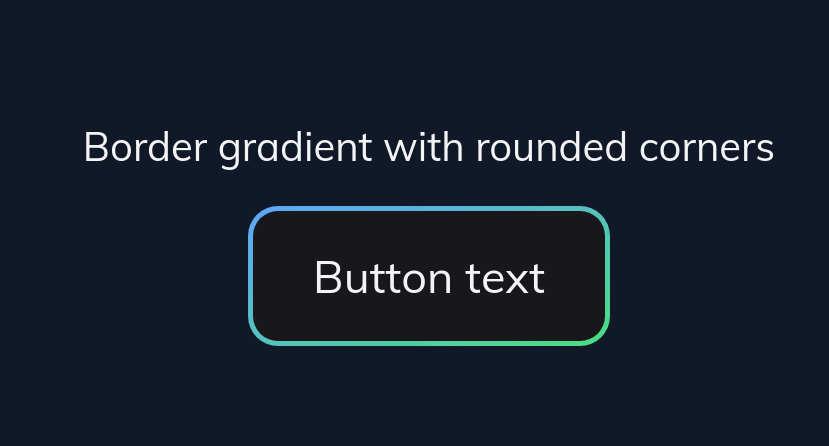
Tailwind CSS plugin for generating border gradients with could be used with the rounded utility class.
The plugin is based on tailwindcss-gradients.

See it in action: https://play.tailwindcss.com/9LSkQgkY7p
Requirements
This plugin requires Tailwind CSS 1.2 or later. It's recommended to use the new 2.x version.
Installation
npm install tailwindcss-border-gradient-radius
yarn add tailwindcss-border-gradient-radius
Usage
Simple
{
  theme: {
    linearBorderGradients: theme => ({
        colors: theme('colors'),
        background: theme('colors'),
        }),
  },
  plugins: [
    require('tailwindcss-border-gradient-radius'),
  ],
}
- With colors you can specify your border gradients.
- With background you can specify your background within your button for example.
- (optional) With border you can specify the border of your border gradient
:warning: Using variants extend is at the moment not supported! Please note that at the moment variants could be only added by using variants, where you replace all default generated variants.
Advanced
{
  theme: {
    linearBorderGradients: {
      directions: { // defaults to these values
        't': 'to top',
        'tr': 'to top right',
        'r': 'to right',
        'br': 'to bottom right',
        'b': 'to bottom',
        'bl': 'to bottom left',
        'l': 'to left',
        'tl': 'to top left',
      },
      colors: { // defaults to {}
        'red': '#f00',
        'red-blue': ['#f00', '#00f'],
        'blue-green': ['#0000ff', '#00FF00'],
        'red-green-blue': ['#f00', '#0f0', '#00f'],
        'black-white-with-stops': ['#000', '#000 45%', '#fff 55%', '#fff'],
      },
      background: {
        'gray-50': '#F9FAFB'.
        'gray-900':'#111827',
      },
      border: { // defaults to these values (optional)
        '1': '1px',
        '2': '2px',
        '4': '4px',
      },
    },

  },
  variants: {
    linearBorderGradients: ['responsive', 'hover', 'dark'], // defaults to ['responsive']
  },
  plugins: [
    require('tailwindcss-border-gradient-radius'),
  ],
}
To learn more about the backgrounds of Gradient Borders based on CSS see Method 2: https://dev.to/rumansaleem/gradient-borders-with-css-3mnk
It's recommended to limit the generated utility classes to a miminum to speed up the build process.
This plugin generates the following utilities:
/* configurable with the "linearBorderGradients" theme object */
.border-gradient-[direction-key]-[color-key]-[background-key] {
    background:
        linear-gradient( to right, [background-value], [background-value] ),
        linear-gradient(to [direction-value], [color-value-1], [color-value2], [color-value-n]);
        background-clip: padding-box, border-box;
        background-origin: padding-box, border-box;
}

/* for easier usage it also generates gradient-border for specifying the border width */
.gradient-border-[border-key] {
  border: [border-value] solid transparent;
}
Example how to use in Tailwind
https://play.tailwindcss.com/9LSkQgkY7p
<div class="bg-gray-900 p-12">
  <div class="text-center">
    <h1 class="text-gray-100 text-medium mb-3">Border gradient rounded and border styled with native tailwind utilities classes </h1>
    <button type="button" class="inline-flex items-center px-6 py-3 border-gradient-br-blue-green-gray-900 border-transparent border-solid border-2 rounded-xl text-gray-100 text-lg">Button text</button>
  </div>
  <div class="text-center m-8 pt-8">
    <h1 class="text-gray-100 text-medium mb-3">Border gradient with rounded-full, hover and gradient-border utility</h1>
    <button type="button" class="inline-flex items-center px-6 py-3 border-gradient-br-blue-green-gray-900 hover:border-gradient-tl-blue-green-gray-900 gradient-border-3 rounded-full text-gray-100 text-lg">Button text</button>
  </div>
</div>