README

A simple to use tab system built with react.
Description
react-smart-tabs is an intuitive tab system built with react, inspired by chrome's tab functionality.
They're simple to use both as a developer and as a user, and take care of all the tab handling logic, so all you need to care about is what components to display.
Features
- Option to allow tabs to be added
- Option to allow tabs to be closed
- Option to allow tabs to be reordered via drag-and-drop
- Tab nesting
- Data Persistence
Usage example
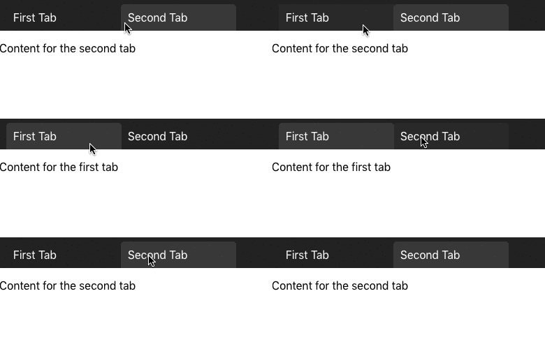
Most basic example. Static Tab Bar with predefined tabs:

import React from 'react';
import { Tab, TabBar } from 'react-smart-tabs';
//This is our default CSS. Feel free to make your own.
import 'react-smart-tabs/dist/bundle.css';

const App = () => (
  <div className="App">
    <TabBar>
      <Tab id='YourTabId1' text="First Tab">
        <div>
          <p>
            Content for the first tab
          </p>
        </div>
      </Tab>
      <Tab id='YourTabId2' text="Second Tab">
        <div>
          <p>
            Content for the second tab
          </p>
        </div>
      </Tab>
    </TabBar>
  </div>
);

export default App;
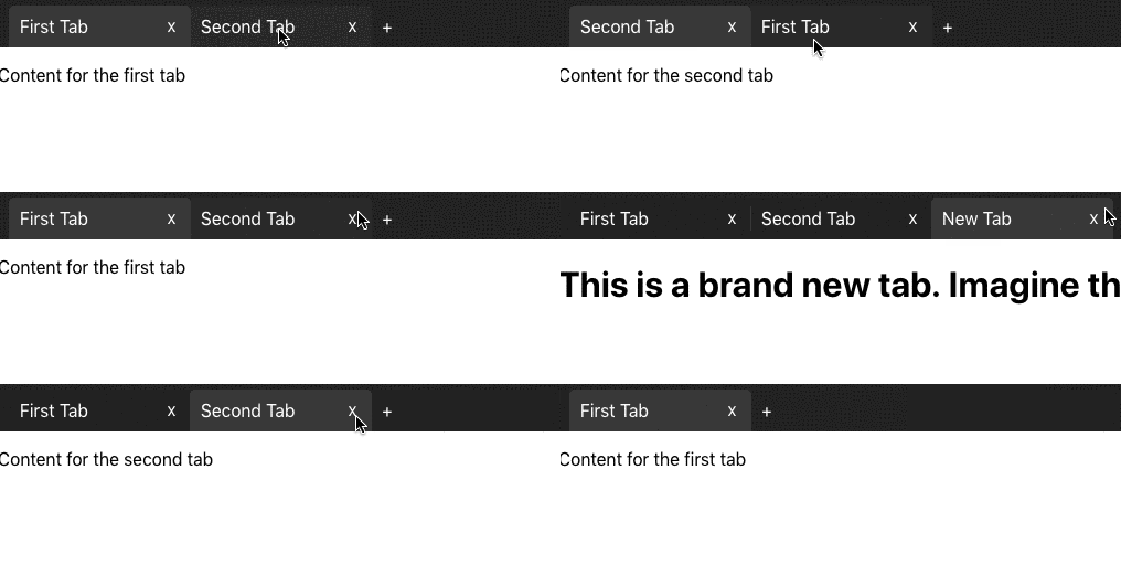
Medium example. Tab Bar that allows the user to create new tabs, close existing tabs, and reorder them by via drag-and-drop:

import React from 'react';
import { Tab, TabBar } from 'react-smart-tabs';
import 'react-smart-tabs/dist/bundle.css'; //This is our default CSS. Feel free to make your own.

const App = () => {
  let dumbId = 0; // Use UUID, or something smarter. This is just an example.

  // This is what the function passed to newTab should look like.
  const AddNewTab = () => {
    // You can customize this however you want.
    dumbId++
    return (
      <Tab id={dumbId} text="New Tab">
        <h1>
          This is a brand new tab. Imagine the possibilities.
        </h1>
      </Tab>
    )
  }

  return (
    <div className="App">
      <TabBar
        newTab={AddNewTab} // Function that returns a <Tab>
        closeable // Allows the user to close tabs
        reorderable // Allows the user to reorder tabs via drag-and-drop
      >
        <Tab id='YourTabId1' text="First Tab">
          <div>
            <p>
              Content for the first tab
            </p>
          </div>
        </Tab>
        <Tab id='YourTabId2' text="Second Tab">
          <div>
            <p>
              Content for the second tab
            </p>
          </div>
        </Tab>
      </TabBar>
    </div>
  );
}

export default App;
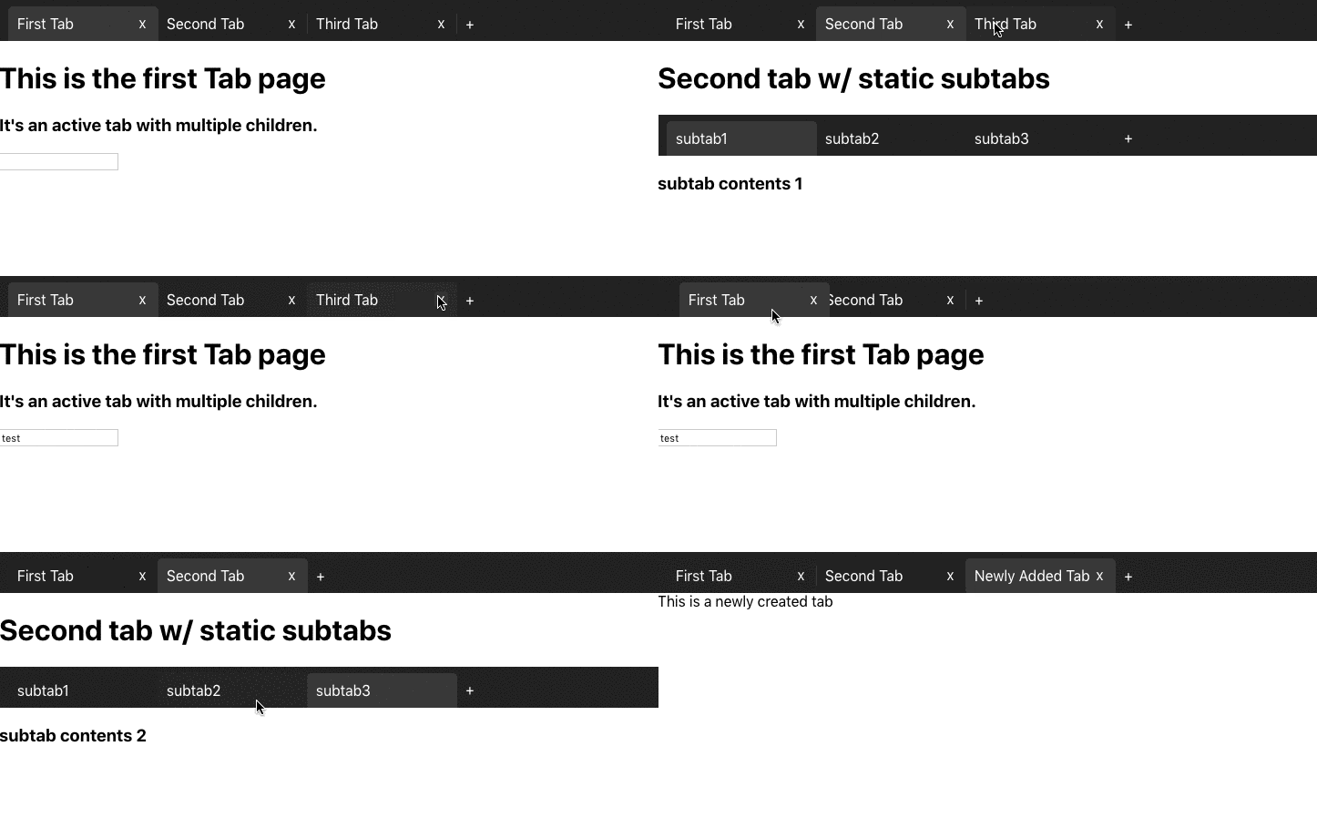
And here's a more complex, detailed example of all the react-smart-tabs functionalities, including nesting tabs (click to collapse)

import React from 'react';
import { Tab, TabBar } from 'react-smart-tabs';
//This is our default CSS. Feel free to make your own.
import 'react-smart-tabs/dist/bundle.css';

// Here you can see a Component with a static tab bar within.
const SecondTabPage = () => (
  <div>
    <h1>
      Second tab w/ static subtabs
    </h1>
    <TabBar>
      <Tab id='yourSubTabId1' text="subtab1">
        <h3>
          subtab contents 1
        </h3>
      </Tab>
      <Tab id='yourSubTabId2' text="subtab2">
        <h3>
          subtab contents 2
        </h3>
      </Tab>
      <Tab id='yourSubTabId3' text="subtab3">
        <h3>
          subtab contents 3
        </h3>
        <input/>
      </Tab>
    </TabBar>
  </div>
)

// And here's a simple component with a form
const ThirdTabPage = () => (
  <div>
    <h1>
      Third tab
    </h1>
    <form className='frm'>
      <h1>
        Form inside the third tab.
      </h1>
      <p>
        Notice that it doesnt lose the input content.
      </p>
      <p>
        Name
      </p>
      <input/>
      <p>
        Surname
      </p>
      <input/>
      <p>
        Adress
      </p>
      <input/>
      <p>
        Telephone
      </p>
      <input/>
    </form>
  </div>
)
function App() {
  let dumbId = 0; // Use UUID to make your IDs. This is just a quick, dumb example.

  const createNewTab = () => {
    // This is what the function passed to newTab should look like.
    // You can customize this however you want.
    dumbId++
    return (
      <Tab id={dumbId} text="Newly Added Tab">
        This is a newly created tab
      </Tab>
    )
  }

  return (
    <div className="App">
      <TabBar
        newTab={createNewTab} // Allows you to add new tabs
        reorderable // Defines if you can reorder the tabs by drag and drop
        closeable // Defines if you can close tabs
      >
        <Tab
          id='YourTabId1' // An ID so you can more easily identify the tabs
          text="First Tab" // The text that will display in the tab bar
          active // Decides if this tab is the active one when you mount
        >
          <h1>This is the first Tab page</h1>
          <p>Its an active tab with multiple children.</p>
          <input/>
        </Tab>
        <Tab id='YourTabId2' text="Second Tab">
          <SecondTabPage/>
        </Tab>
        <Tab id='YourTabId3' text="Third Tab">
          <ThirdTabPage/>
        </Tab>
      </TabBar>
    </div>
  );
}

export default App;
Installation
Install the lib as a dependency
npm install --save react-smart-tabs
Then import and use them like the demos above.
import { Tab, TabBar } from 'react-smart-tabs';
//This is our default CSS. You can use it or make your own.
import 'react-smart-tabs/dist/bundle.css';
Release History
- 0.0.14
- FIX: Fixed the NPM bundle so it's lighter.
Want to contribute?
Follow these steps: 0. Check the open issues. Assign one to yourself or create one.
- Fork the repository (https://github.com/EvoluxBR/react-smart-tabs/fork)
- Create your branch (
git checkout -b feature/fooBar) within your forked version - Make your feature :D
- Commit your changes (
git commit -am 'Add some fooBar') - Push to the branch (
git push origin feature/fooBar) - Create a new Pull Request and wait for feedback.
Distributed under the MIT license. See LICENSE for more information.

