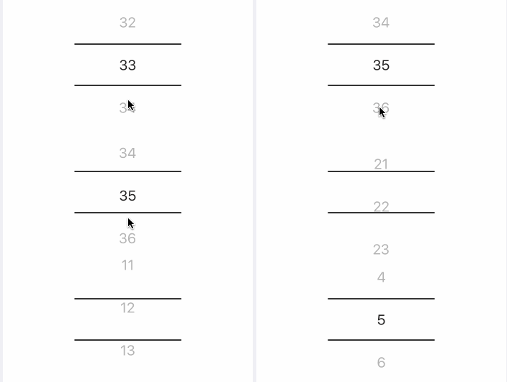
README
react-native-wheel-scrollview-picker

A pure js picker for React Native

- Original repository by @veizz: react-native-picker-scrollview.
- Fork by @yasemincidem who added the real cross platform behavior and datepicker react-native-wheel-scroll-picker.
- This is the third fork of repository, since it seems that @yasemincidem is no longer supporting react-native-wheel-scroll-picker.
Table of Contents
Installation
yarn add react-native-wheel-scrollview-picker
# or
npm install react-native-wheel-scrollview-picker --save
Usage
import React, { Component } from 'react';
import ScrollPicker from 'react-native-wheel-scrollview-picker';

export default class SimpleExample extends Component {
  render() {
    return (
      <ScrollPicker
        dataSource={['1', '2', '3', '4', '5', '6']}
        selectedIndex={1}
        renderItem={(data, index) => {
          //
        }}
        onValueChange={(data, selectedIndex) => {
          //
        }}
        wrapperHeight={180}
        wrapperWidth={150}
        wrapperColor='#FFFFFF'
        itemHeight={60}
        highlightColor='#d8d8d8'
        highlightBorderWidth={2}
      />
    );
  }
}
Props
| Props | Description | Type | Default |
|---|---|---|---|
| dataSource | Data of the picker | Array | |
| selectedIndex | selected index of the item | number | 1 |
| wrapperHeight | height of the picker | number | |
| wrapperWidth | width of the picker | number | |
| wrapperBackground | picker background | string | '#FFF' |
| itemHeight | height of each item | number | |
| highlightColor | color of the indicator line | number | "#d8d8d8" |
| highlightBorderWidth | width of the indicator | string | 1 |
| activeItemTextStyle | Active Item Text object style | object | |
| itemTextStyle | Item Text object style | object |
Author
License
MIT