README
react-native-tour

npm install react-native-tour
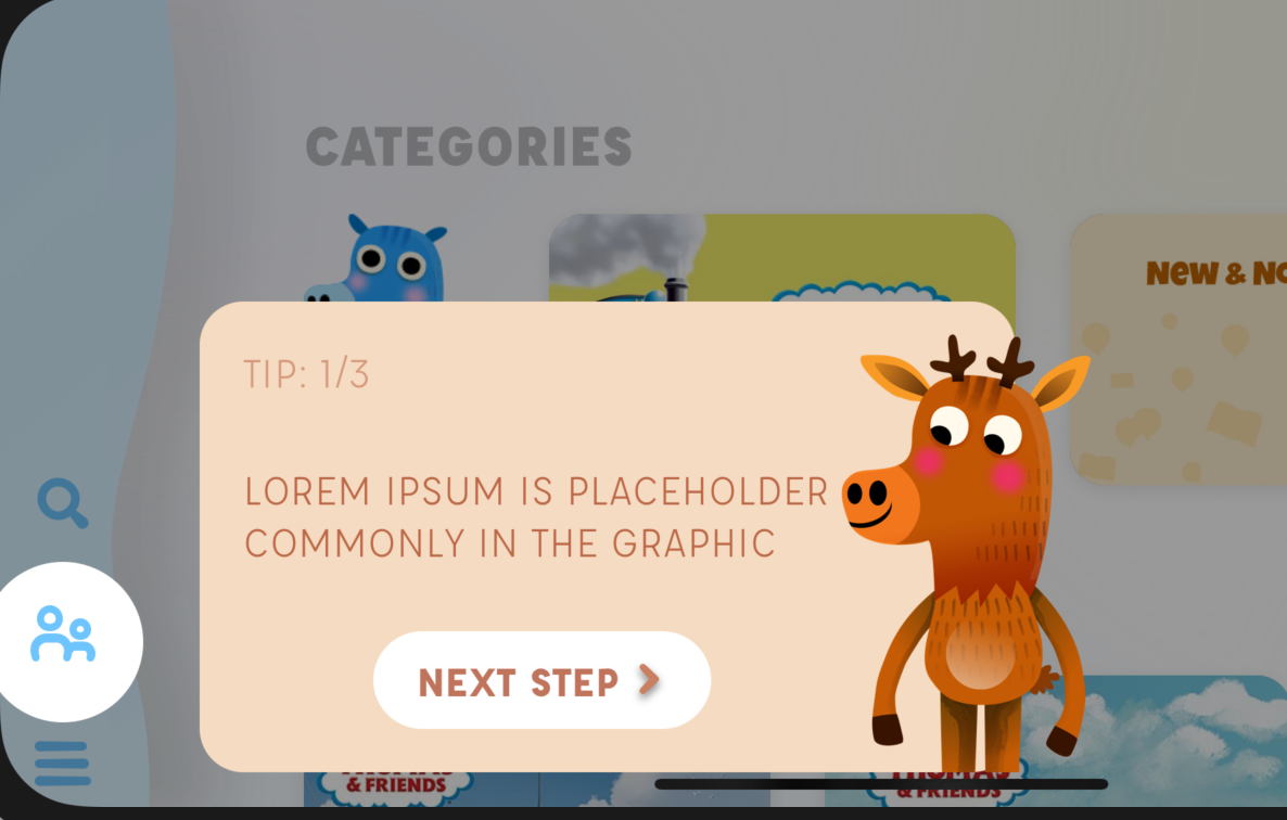
React Native Tour is the easiest way to guide your users around your app. It gives complete flexibility over how your guide items look. The library handles circling the important part of the screen and it's up to you to make a tool tip component that looks the way you want.
Setup
At the top level of your app, import the provider. You must be using React 16+
import steps from './steps';
import { Tour } from 'react-native-tour';

<Tour steps={steps}>
  <Navigation />
</Tour>;
You'll notice a prop called steps. This is an array of steps that you can define. It looks like this:
import React from 'react';
import { Text } from 'react-native';
import Step from './step';

export default [
  {
    name: 'friends',
    component: ({ close, next, currentStep, totalSteps }) => (
      <Step position="rightSide">
        <Text>LOREM IPSUM PLACEHOLDER</Text>
      </Step>
    ),
  },
  {
    name: 'share',
    beforeStep: async () => store.dispatch(showBook('bookName')),
    component: ({ close, next, currentStep, totalSteps }) => (
      <Step {...props} position="bottomLeft">
        <Text>This is a share button</Text>
      </Step>
    ),
  },
];
Each step you make needs a unique name. Then it has a few properties on it. You can run something before the step. In the case of our share one, this will go to the screen that has that thing on it first, before rendering.
How your step component looks is up to you. This is the actual component rendered next to the circle.
Attach the steps
After defining steps, anywhere in your app you can highlight and place the step by using Attach
import { Attach } from 'react-native-tour';

<Attach name="share">
  <Icon name="some random share icon component" />
</Attach>;
Now when the step is active, it will render a circle and your step component.
Starting the tour
import { Consumer } from 'react-native-tour';

<Consumer>{({ start }) => <SomeButton onPress={start} />}</Consumer>;
Props
Consumer
The consumer gets the following data:
nextStep: next step objectpreviousStep: previous step objectstep: the current step objectstart: Starts the first step
Attach
The attach component takes one prop, the name of the step to attach to.
Tour provider
The tour provider at the top of your app takes two props:
steps: the step arrayhighlightComponent: Custom component to wrap the highlighted partinitialStep: If you wish to immediately start the tour, pass the array index to showonCompletedStep={({ step}) => step}: Gives you the latest completed step, for analytics purposes
Steps api
{
   //unique name
    name: 'share',

    //OPTIONAL: async function that is waited on before rendering the step
    beforeStep: async () => {}

    //the component to render at the highlighted area where `Attach` is located
    component: props => (
      <Step {...props} position="bottomLeft">
        <Text style={styles.text}>LOREM IPSUM IS 3</Text>
        <Text style={styles.text}>COMMONLY IN THE GRAPHIC</Text>
      </Step>
    ),
  }
component receives the following:
close: function to stop the tournext: function to trigger the next stepcurrentStep: Current step as an integertotalSteps: Number of total steps