README
React Native Slider Text
Read more about this package here.
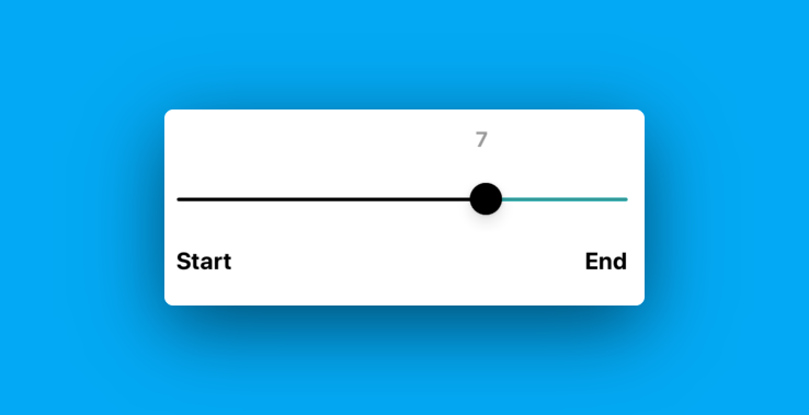
A React Native Slider Component which is built around react-native-slider providing the user ability to add moving slider value alongside the slider thumb. You can also add custom labels displaying the start text and end text below the slider.


Prerequisites
Kindly install @react-native-community/slider before you start using this component.
yarn add @react-native-community/slider
Using React Native CLI
Install
yarn add react-native-slider-text
or
npm install react-native-slider-text --save
Usage
import React, { useState } from 'react';
import { View, Text, StyleSheet } from 'react-native';
import SliderText from 'react-native-slider-text';

const Score = () => {
  const [sliderValue, setSliderValue] = useState(0);
  return (
    <View style={styles.container}>
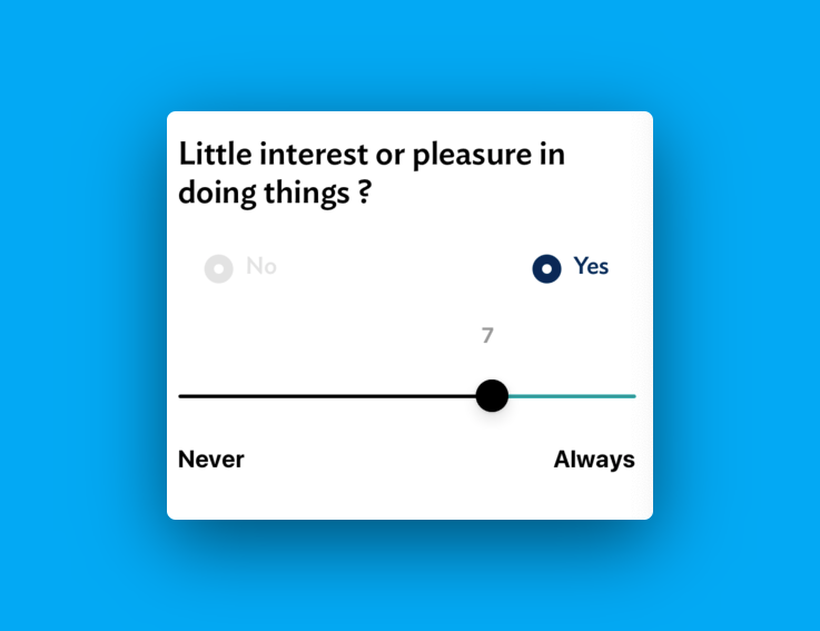
      <Text style={styles.title}>Little interest or pleasure in doing things?</Text>
      <Text style={styles.tag}>Rate your answer here: </Text>
      <SliderText maximumValue={10} stepValue={1} minimumValueLabel="Never" maximumValueLabel="Always" onValueChange={(id) => setSliderValue(id)} sliderValue={sliderValue} />
    </View>
  );
};

const styles = StyleSheet.create({
  container: {
    flex: 1,
    padding: 10,
  },
  title: {
    fontSize: 24,
    fontWeight: 'bold',
  },
  tag: {
    fontSize: 14,
    paddingVertical: 10,
  },
});

export default Score;
Props
| Prop | Description | Default |
|---|---|---|
maximumValue |
Add the maximum value of the slider here. (Number) | 10 |
minimumValue |
Add the minimum value of the slider here. (Number) | 0 |
stepValue |
Step value of the slider (Number) | 1 |
value |
value of the slider (Number) | 1 |
sliderValue |
dynamic value of the slider (Number) | 1 |
multiplier |
This is the universal logic to adjust the text location over the thumb. User may need to manipulate it depending on the maximum value. (Decimal value) | 1.12 |
minimumTrackTintColor |
Custom color for minimum slider progress. (color) | #000 |
thumbTintColor |
Custom color for thumb. (color) | #000 |
maximumTrackTintColor |
Custom color for maximum slider progress. (color) | #000 |
customCountStyle |
Customize moving text slider value. You can add any styles related to Text Component in React Native. (style) | - |
customLabelStyle |
Customize label style below the slider. You can add any styles related to Text Component in React Native. (style) | - |
onValueChange |
function to manage the slider value on change of the slider thumb position. (function) | - |
License
Licensed under the MIT.
Donation
If this project helped you reduce time to develop, please consider buying me a cup of coffee :)


