README
react-native-simple-bottom-sheet
A simple react native bottom sheet component
| Example 1 | Example 2 | Example 3 |
|---|---|---|
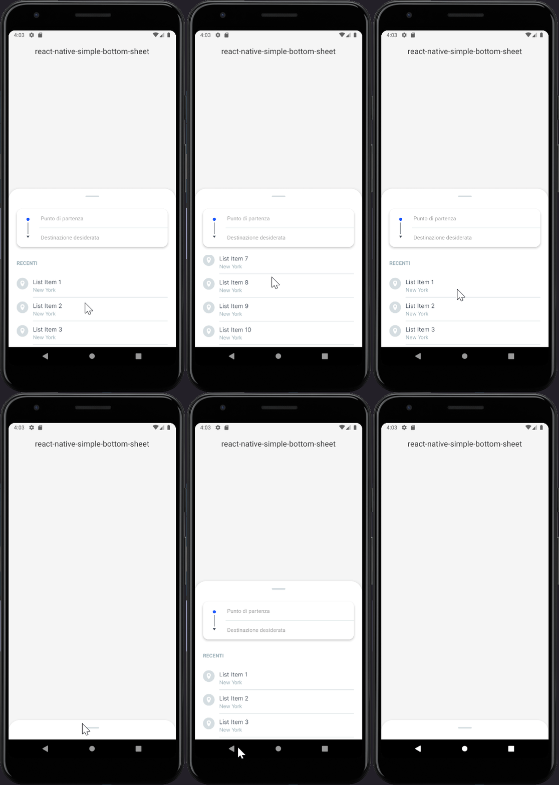 |
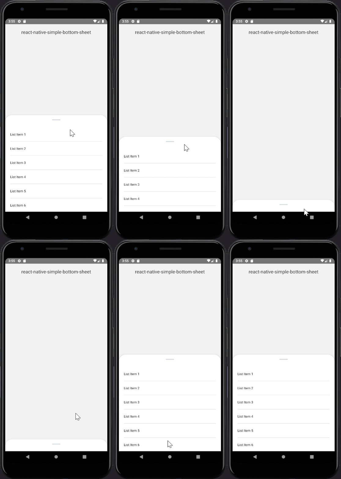 |
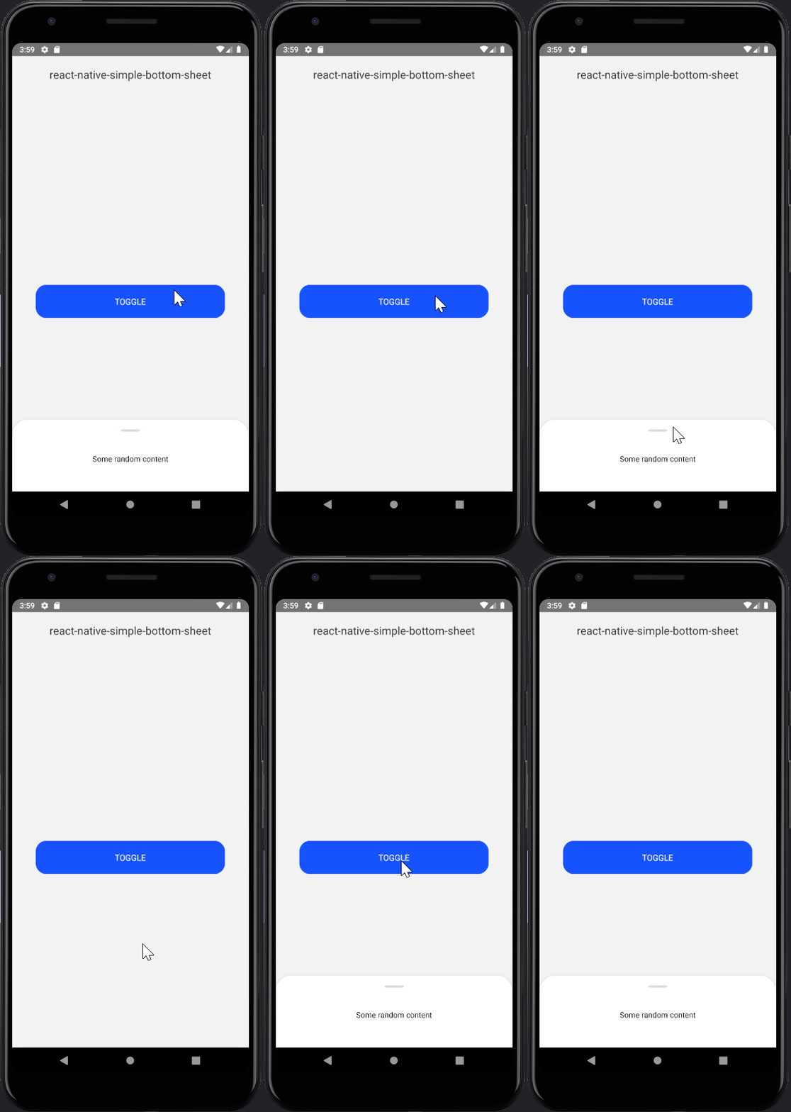 |
Table of Contents
Installation
npm i --save react-native-simple-bottom-sheet
Usage
import BottomSheet from 'react-native-simple-bottom-sheet';

function App() {
  return (
    <View style={{flex: 1}}>
      <View>Your content</View>
      <BottomSheet isOpen>
        // The component to render inside the panel
        <View />
      </BottomSheet>
    </View>
  );
}
By default the height of the panel tries to adapt to the content height till the sliderMaxHeight value is reached.
If you want the content to scroll inside the panel use ScrollView/FlatList like this:
function App() {
  return (
    <View style={{flex: 1}}>
      <View>Your content</View>
      <BottomSheet isOpen>
        {(onScrollEndDrag) => (
          <ScrollView onScrollEndDrag={onScrollEndDrag}>
            {[...Array(10)].map((_, index) => (
              <View key={`${index}`} style={styles.listItem}>
                <Text>{`List Item ${index + 1}`}</Text>
              </View>
            ))}
          </ScrollView>
        )}
      </BottomSheet>
    </View>
  );
}
This allows the panel to close when the user reaches the top of the scrollable content and drags the panel down again. Example:
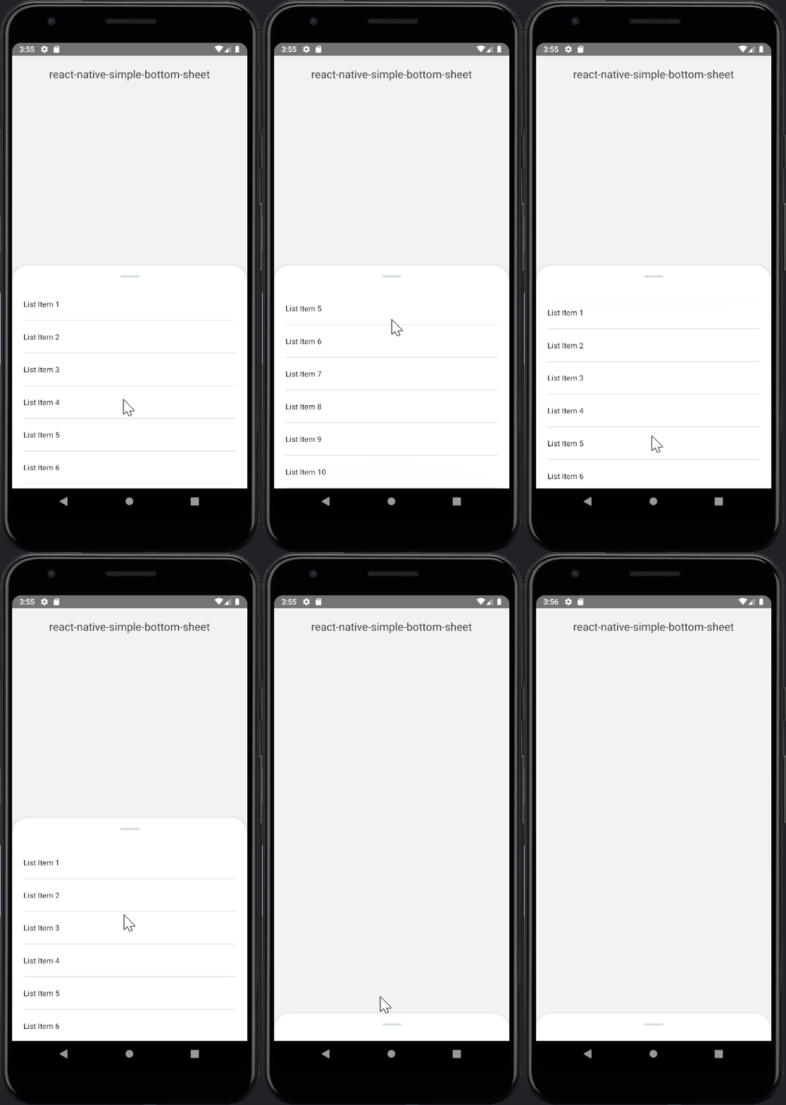
By default when the panel is closed you can drag it up again thanks to the part of the panel that remains
on the bottom side of the screen. If you want to completely hide it you can set the sliderMinHeight prop
to 0 and use the togglePanel method to bring it up.
function App() {
  const panelRef = useRef(null);

  return (
    <View style={{flex: 1}}>
      <View>Your content</View>
      <TouchableOpacity onPress={() => panelRef.current.togglePanel()}>
        <Text>Toggle</Text>
      </TouchableOpacity>
      <BottomSheet ref={ref => panelRef.current = ref}>
        <Text style={{paddingVertical: 20}}>
          Some random content
        </Text>
      </BottomSheet>
    </View>
  );
}

Props
| Prop Name | Type | Default | Description |
|---|---|---|---|
| children | func or node | <View /> |
A component or a render function. Use toggleSlider function instead |
| isOpen | boolean | true |
Initial state of the panel; true to render it opened, false otherwise. Important: Do not try to open/close the panel througth this prop, see togglePanel method instead |
| sliderMinHeight | number | 50 |
Min height of the panel |
| sliderMaxHeight | number | Dimensions.get('window').height * 0.5 |
Max height of the panel |
| animation | func | Easing.quad |
The close/open animation of the panel |
| animationDuration | number | 200 |
How long the panel takes to open/close |
| onOpen | function | () => null |
Function to execute when the panel is opened |
| onClose | function | () => null |
Function to execute when the panel is closed |
| wrapperStyle | object | {} |
Custom style for the panel wrapper |
| outerContentStyle | object | {} |
Custom style for the outer content |
| innerContentStyle | object | {} |
Custom style for the inner content |
| lineContainerStyle | object | {} |
Custom style for the line container |
| lineStyle | object | {} |
Custom style for the line |
Methods
| Name | Description |
|---|---|
| togglePanel | Function to close/open the panel |
License
Author
Made by Stefano Martella