README
react-native-option-switch
The React Native component to provide UI with option selection like radio button or yes/no choice.
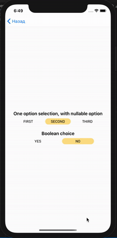
Demo:
Install
npm i --save react-native-option-switch
Params
| Param | Description |
|---|---|
options (required) |
An array of options, each option is an object with particular fields: key(don't use with isBool={true}), title, value, isDefault (optional). |
onChange |
A handler of the value change event. A function that accepts a new value as the first param. |
styles |
Object with custom styles for the component. You can use these fields to customize whole component (container field), items (item and selectedItem) and item labels (label). |
isNullable |
Default is false. Set true in case of nothing to select. |
Usage
<View style={{ flex: 1, justifyContent: 'center' }}>
    <Text style={{
        fontWeight: '600',
        fontSize: 18,
        margin: 16,
        marginBottom: 8,
        textAlign: 'center'
    }}>One option selection, with nullable option</Text>
    <OptionSwitch
        isNullable={true}
        styles={{
            item: {
                width: 100,
                height: 24,
                borderRadius: 12,
                marginHorizontal: 8,
                alignItems: 'center',
            },
            selectedItem: {
                width: 100,
                height: 24,
                borderRadius: 12,
                marginHorizontal: 8,
                backgroundColor: '#FDE08C',
                alignItems: 'center',
            },
        }}
        options={[
            {
                label: 'First',
                value: 'first'
            }, {
                label: 'Second',
                value: 'second',
                isDefault: true,
            }, {
                label: 'Third',
                value: 'third',
            }
        ]}
    />
    <Text style={{
        fontWeight: '600',
        fontSize: 18,
        margin: 24,
        marginBottom: 8,
        textAlign: 'center'
    }}>Boolean choice</Text>
    <OptionSwitch
        onChange={(value) => {

        }}
        options={[
            {
                label: 'Yes',
                value: false
            }, {
                label: 'No',
                value: true,
                isDefault: true,
            }
        ]}
    />
  </View>