README
react-native-month-year-picker
React Native month picker component for iOS and Android.
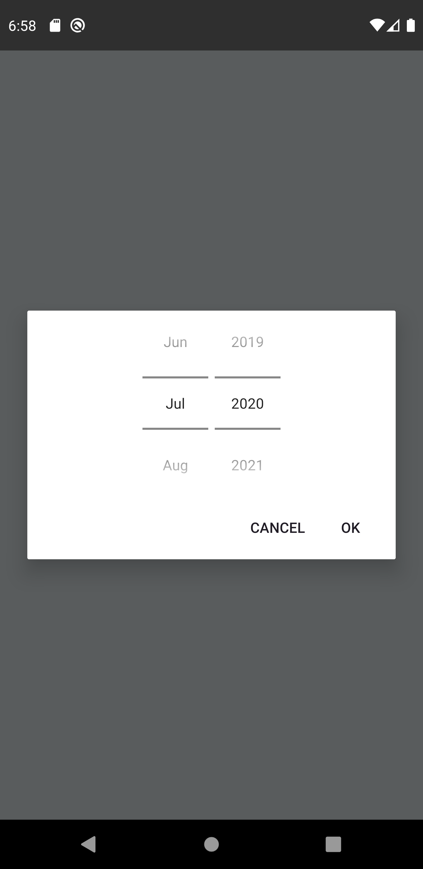
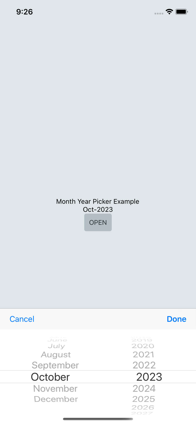
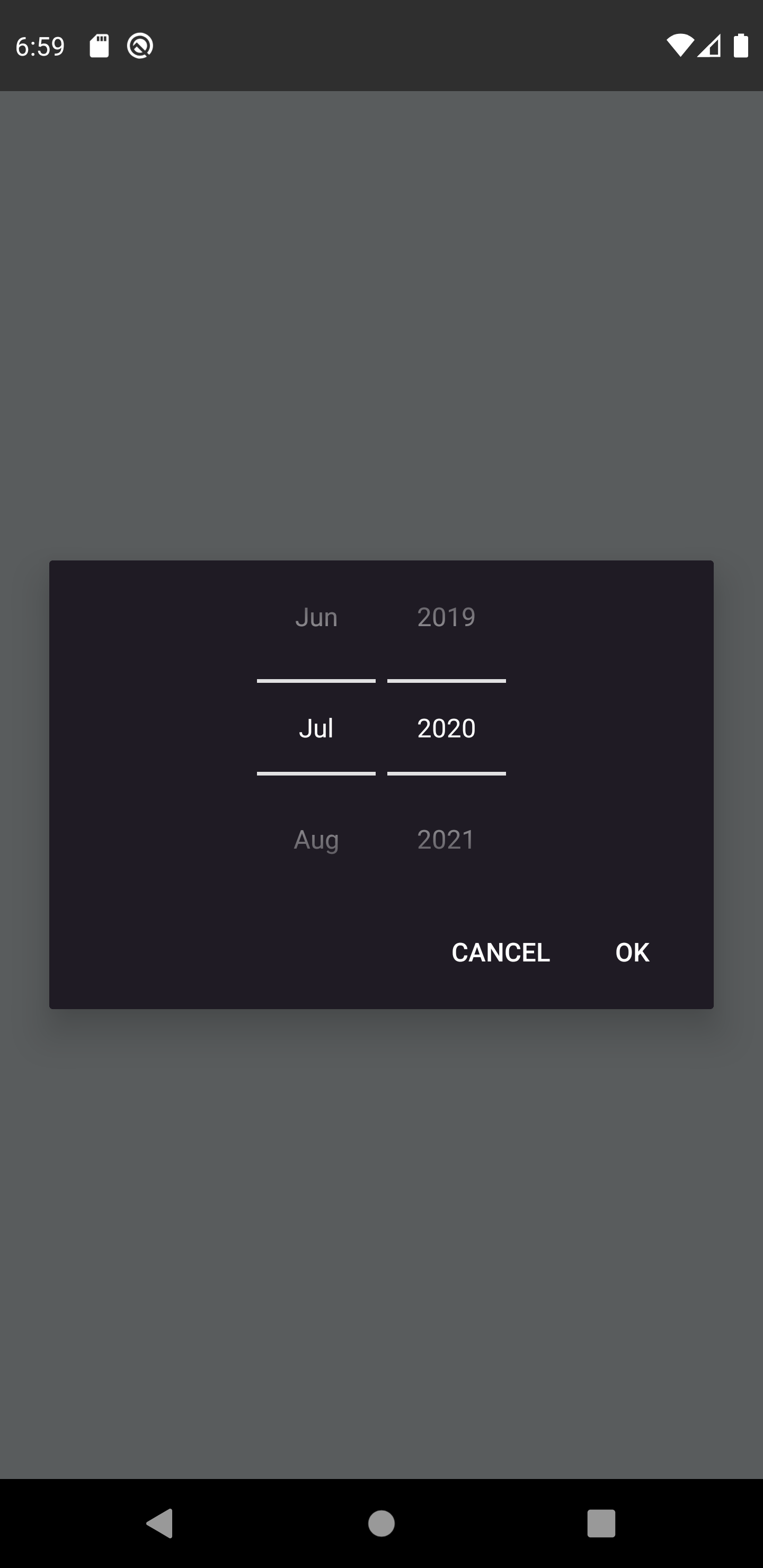
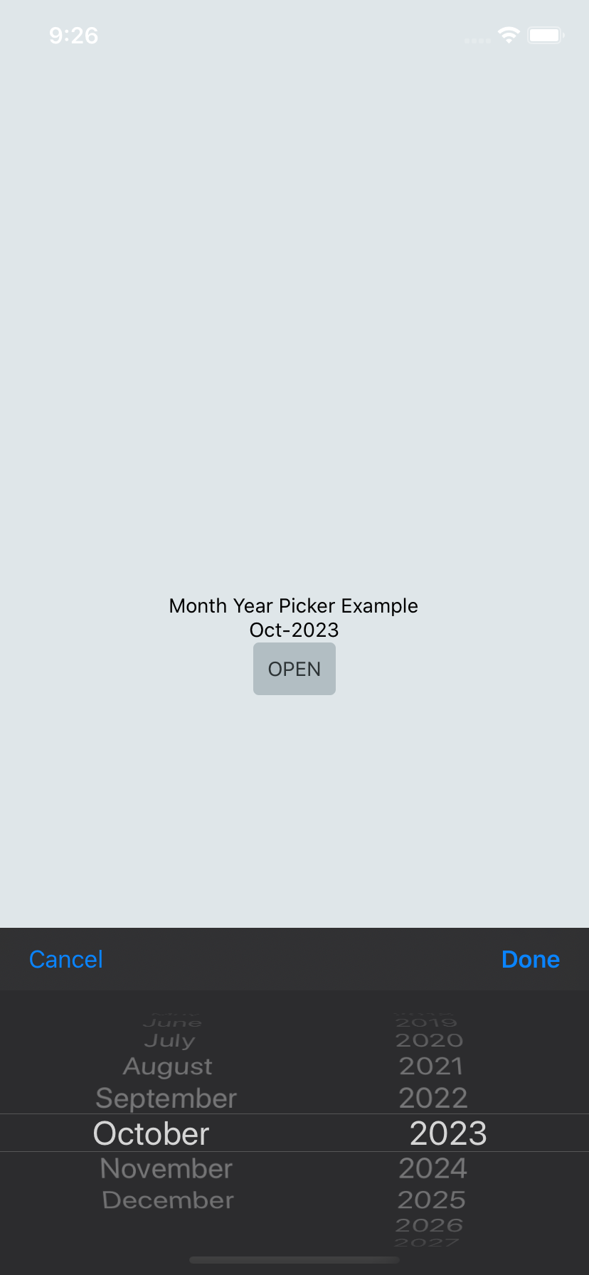
| UI Mode | Android | iOS |
|---|---|---|
Light |
 |
 |
Dark |
 |
 |
Getting started
$ npm install react-native-month-year-picker --save
or
$ yarn add react-native-month-year-picker
For react-native@0.60.0 or above
As react-native@0.60.0 or above supports autolinking, so there is no need to run linking process. Read more about autolinking here.
iOS
CocoaPods on iOS needs this extra step
npx pod-install
Usage
import React, { useState, useCallback } from 'react';
import { View, SafeAreaView, Text } from 'react-native';
import MonthPicker from 'react-native-month-year-picker';

const App = () => {
  const [date, setDate] = useState(new Date());
  const [show, setShow] = useState(false);

  const showPicker = useCallback((value) => setShow(value), []);

  const onValueChange = useCallback(
    (event, newDate) => {
      const selectedDate = newDate || date;

      showPicker(false);
      setDate(selectedDate);
    },
    [date, showPicker],
  );

  return (
    <SafeAreaView>
      <Text>Month Year Picker Example</Text>
      <Text>{moment(date, "MM-YYYY")}</Text>
      <TouchableOpacity onPress={() => showPicker(true)}>
        <Text>OPEN</Text>
      </TouchableOpacity>
      {show && (
        <MonthPicker
          onChange={onValueChange}
          value={date}
          minimumDate={new Date()}
          maximumDate={new Date(2025, 5)}
          locale="ko"
        />
      )}
    </SafeAreaView>
  );
};

export default App;
Props
onChange (optional)
Date change handler.
This is called when the user changes the date in the UI. It receives the event and the date as parameters.
setDate = (event, date) => {};

<RNMonthPicker onChange={this.setDate} />;
Events returned by onChange function:
import { ACTION_DATE_SET, ACTION_DISMISSED, ACTION_NEUTRAL } from 'react-native-month-year-picker';
...
onValueChange = (event, newDate) => {
  switch(event) {
    case ACTION_DATE_SET:
      onSuccess(newDate);
      break;
    case ACTION_NEUTRAL:
      onNeutral(newDate);
      break;
    case ACTION_DISMISSED:
    default:
      onCancel(); //when ACTION_DISMISSED new date will be undefined
  }
}
...
value (required)
Defines the date value used in the component.
<RNMonthPicker value={new Date()} />
locale (optional)
Defines the month list locale. If not sent, it defaults to device's language.
<RNMonthPicker locale="ru" />
mode (optional)
Defines the month list display mode. It could be either full, short, number or shortNumber. Default full.
| mode | display |
|---|---|
| full | September |
| short | Sep |
| number | 09 |
| shortNumber | 9 |
<RNMonthPicker mode="number" />
autoTheme (optional)
Enables phone's UI Mode color recognition; for Android 10+ and iOS 13+. Lower OS versions will always be Light Mode. Default true.
<RNMonthPicker autoTheme={false} />
maximumDate (optional)
Defines the maximum date that can be selected. Use year and month constructor.
<RNMonthPicker maximumDate={new Date(2030, 10)} />
minimumDate (optional)
Defines the minimum date that can be selected. Use year and month constructor.
<RNMonthPicker minimumDate={new Date(2020, 5)} />
okButton (optional)
Picker modal confirmation button text. Default Done.
<RNMonthPicker okButton="Confirm" />
cancelButton (optional)
Picker modal cancelation button text. Default Cancel.
<RNMonthPicker cancelButton="Abort" />
neutralButton (optional)
Picker modal neutral button text. If not sent, button won't appear. Default null.
<RNMonthPicker neutralButton="Delete" />
Running example
- Install required pods by running
yarn pod:install. - Run
yarn startto start Metro Bundler. - Run
yarn run:iosoryarn run:android.