README
react-native-marquee-scroll
Updated by Nick Mandylas. Credit to Mohammad Hasanzadeh.
A cross-platform marquee component for React Native.
This is a JavaScript-only implementation marquee. It's super customizable, allowing you to customize play direction,reapete number....
Features
- Smooth animations
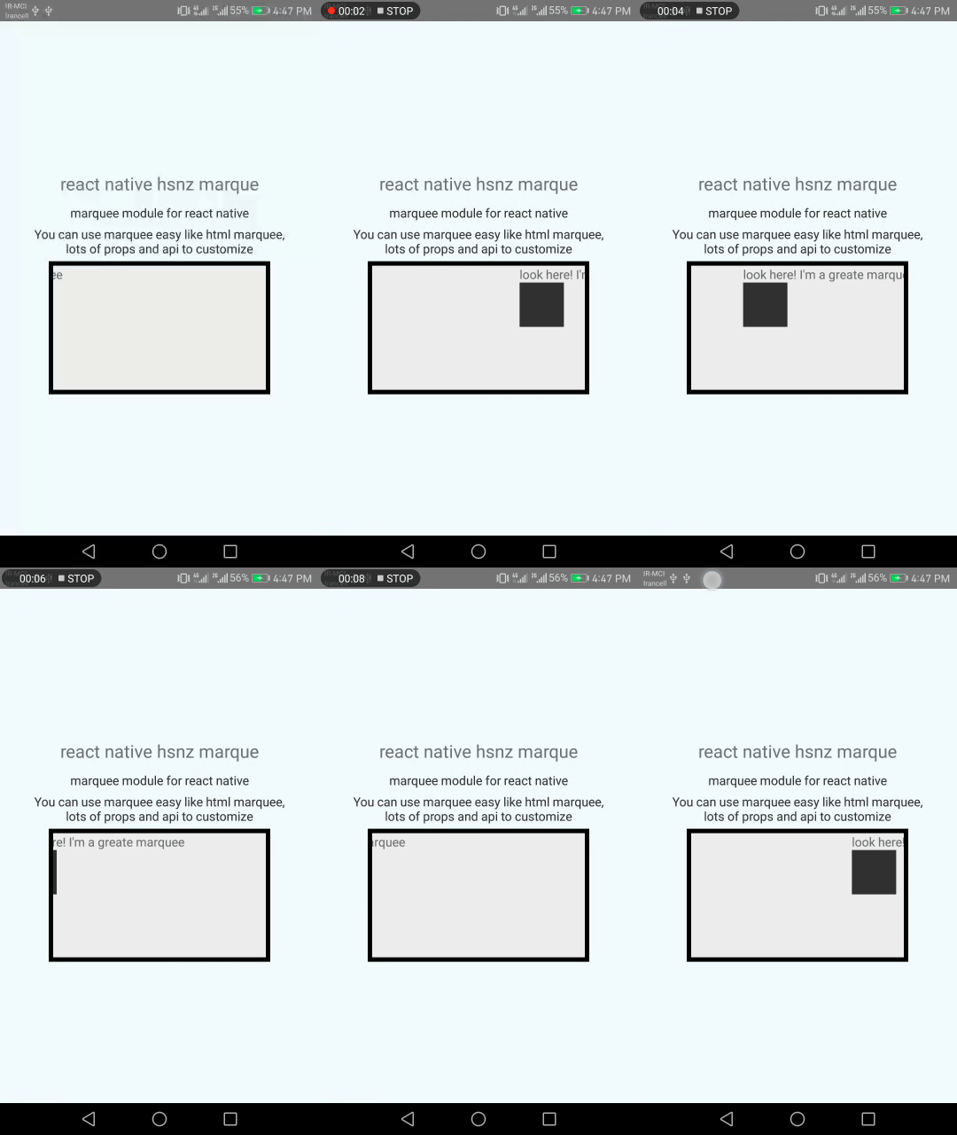
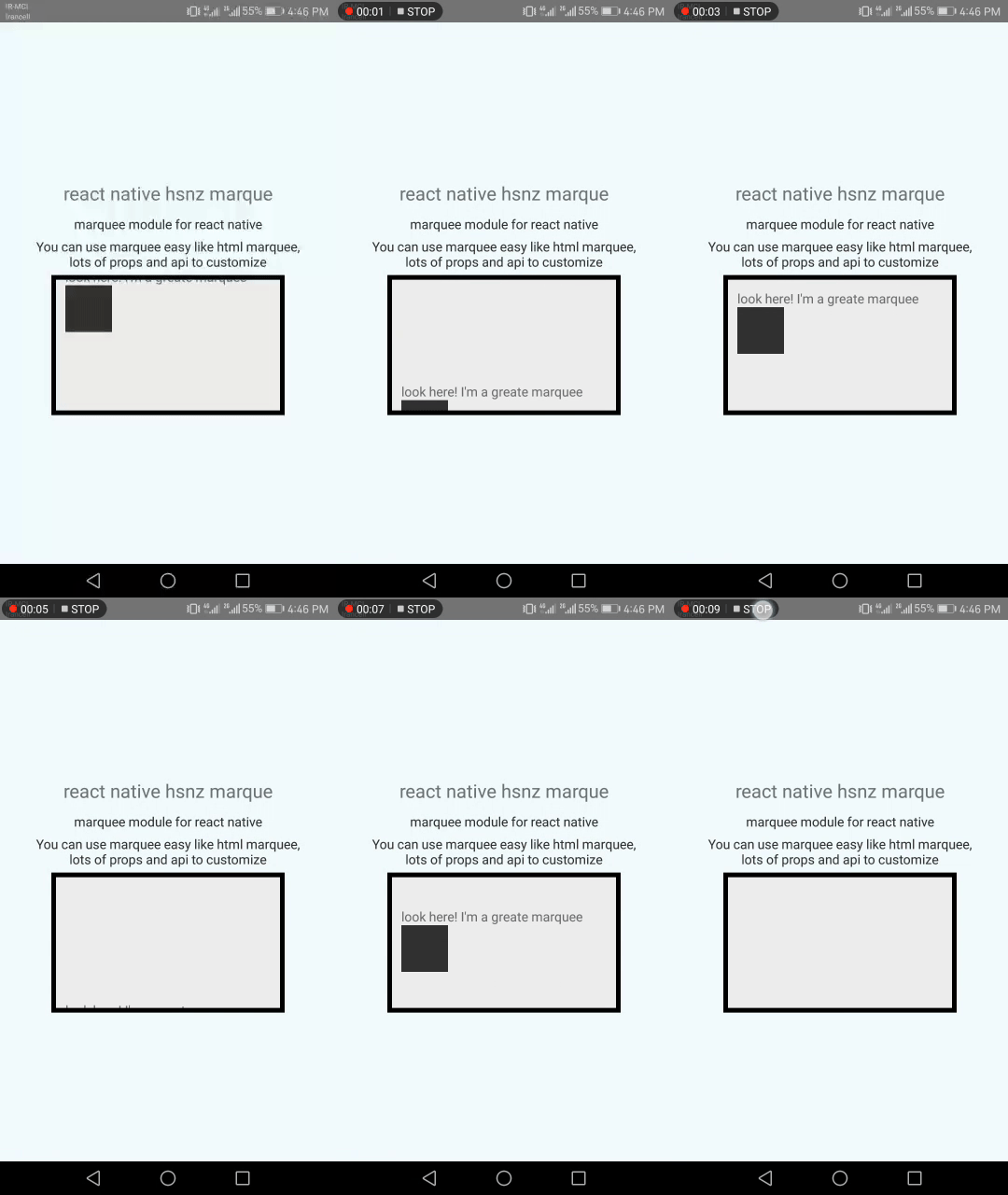
- for direction(left to right,right to left,top to bottom and bottom to top)
- supporting to scroll any component and view.
- pause,stop and resume api to control animation
- customizable play speed
Demo
Installation
npm install react-native-hsnz-marquee --save
Quick Start
import React, { Component } from "react";
import {
  Platform,
  Dimensions,
  StyleSheet,
  Text,
  View,
  ToastAndroid,
  Image,
} from "react-native";
import HSNZ from "react-native-marquee-scroll";

export default class App extends Component {
  constructor(props) {
    super(props);
    this.end = this.end.bind(this);
  }
  end() {
    console.log("end of play");
  }

  render() {
    return (
      <View style={styles.container}>
        <Text style={styles.welcome}>react native hsnz marque</Text>
        <Text style={styles.instructions}>marquee module for react native</Text>
        <Text style={styles.instructions}>{instructions}</Text>
        <HSNZ
          style={{
            height: 150,
            width: 250,
            backgroundColor: "#eee",
            borderWidth: 5,
          }}
          onEnd={this.end}
        >
          <Text> look here! I am a greate marquee</Text>
          <View
            style={{
              height: 50,
              width: 50,
              backgroundColor: "#333",
              marginLeft: 10,
            }}
          ></View>
        </HSNZ>
      </View>
    );
  }
}

const styles = StyleSheet.create({
  container: {
    flex: 1,
    justifyContent: "center",
    alignItems: "center",
    backgroundColor: "#F5FCFF",
  },
  welcome: {
    fontSize: 20,
    textAlign: "center",
    margin: 10,
  },
  instructions: {
    textAlign: "center",
    color: "#333333",
    marginBottom: 5,
  },
});
Props
autoPlay: boolean prop. when is true it will be start just after rendering but by false value it will waite until start method call. default is true.directionstring enum that get one of four these values:rtl: for left to right paly direction ,ltr: for right to left play direction ,ttb: for top to bottom pay direction ,btt: for bottom to top play direction . default value isrtlspeed: int value which determine marquee play speed defualt is 40loop: positive int value which determine num of repeates of play. there is only one exception for unlimited play: by -1 value will play unlimited. defualt is -1.onEnd: callback which call by end of end of the loops.
Example
<HSNZ
  style={{ height: 150, width: 250, backgroundColor: "#eee", borderWidth: 5 }}
  ref={(ref) => {
    this.reff = ref;
  }}
  loop={-1}
  direction={"rtl"}
  autoPlay={true}
  speed={20}
  onEnd={this.end}
>
  <Text> look here! I am a greate marquee</Text>
  <View
    style={{ height: 50, width: 50, backgroundColor: "#333", marginLeft: 10 }}
  ></View>
</HSNZ>
API
start : start playing marquee if not playing.
puase : puase playing marquee which can resume again by start method and not calling onEnd callback.
stop : stop playing marquee which can not resume again and call onEnd callback.

