README
react-native-just-checkbox
CheckBox component for React Native
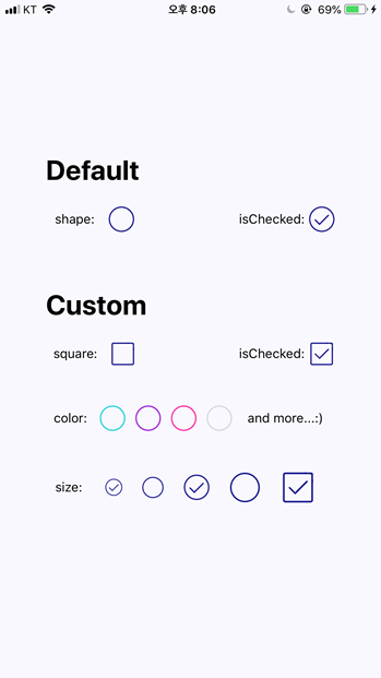
- customizable color & size & shape
- support both iOS and android
Installation
$ npm install react-native-just-checkbox --save
Example
import CheckBox from 'react-native-just-checkbox'

<CheckBox
   isChecked={true}
   checkBoxSize={40}
   checkColor='darkturquoise'
   squareCheckBox={true}
/>
Preview
Props
| PROPS | DESCRIPTION | TYPE |
|---|---|---|
| isChecked | initial state of the checkbox, DEFAULT: false | bool |
| checkBoxSize | size of the checkbox, DEFAULT: 30 | number |
| checkColor | color of the checkbox, follow 'React Native Named colors', DEFAULT: 'navy' | string |
| squareCheckBox | By default, we provide a circle-checkbox. By settting this props to true change the shape of the checkbox to square. No props are needed for the circle-checkbox. | bool |
| onToggle | function which is invoked when the checkbox is clicked | function |