README
Customizable, easy-to-use, performant calendar components for React Native.
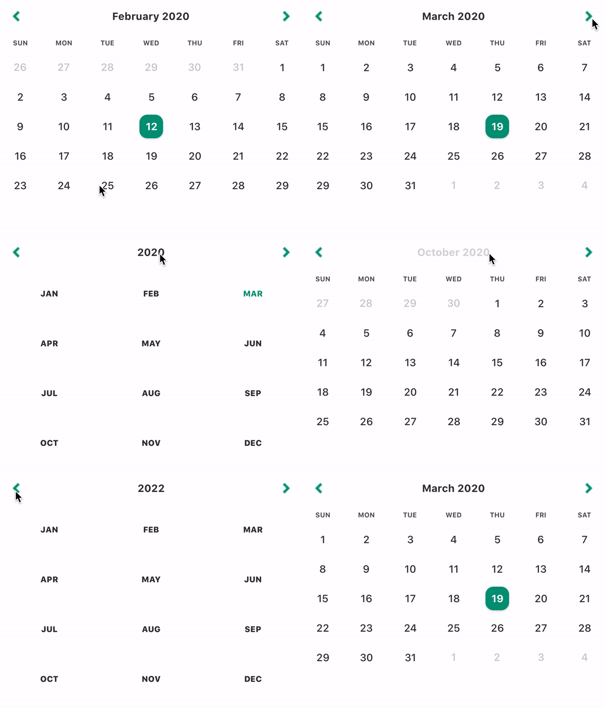
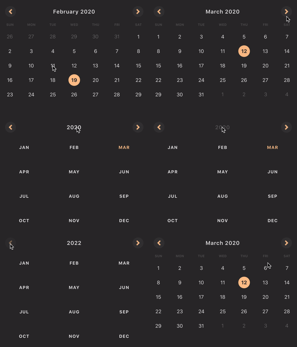
Features
🎁 Lean APIs
A different calendar for each use case, which makes for simpler, more contextual component APIs🎨 Shareable Themes
Support for highly granular, shareable themes🗺 i18n
Support for locales through Dayjs, which offers 138 locales out of the box🎮 Controlled Components
Controlled components elimate the need for most onEvent() callbacks and allow you more power over date selection logic⭐️ Typescript Support
Typescript support out of the box💡 Sane Defaults
Calendars come with sane defaults and only allow component structure/behaviour to be altered by passing in custom components, not through behavior-altering props
Table of Contents
Roadmap
In the next couple of releases:
- code coverage improvements ✅ (v0.1.1)
- add E2E tests to CI pipeline ✅ (v0.1.2)
- multi-date selection support ✅ (v0.2.0)
- new period selection calendar
- accessibility improvements
- translate README to Brazilian Portuguese
Compatibility
We're compatible with RN 0.59+.
Try it out
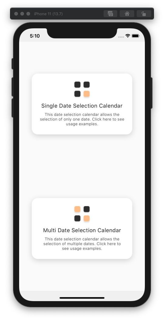
To check out the package, run the example app by executing these steps:
$ git@github.com:aryella-lacerda/react-native-easy-calendar.git
$ cd react-native-easy-calendar
$ yarn bootstrap                  // install dependencies
$ yarn example start              // start Metro Bundler
$ yarn example [ios/android]      // install app
Installation
RN Easy Calendar has no dependencies and only one peer dependency. Dayjs has all the power of Momentjs's API at only a tiny fraction of the size (2kb, compared to momentjs's 69.6kb).
$ yarn add react-native-easy-calendar dayjs
Usage

Themes
The theme prop is optional. If you don't pass the theme prop, the calendar will use the DefaultTheme. Both the Theme entity and the DefaultTheme object have been exported for your use.
import { DateSelectionCalendar, DefaultTheme, Theme } from 'react-native-easy-calendar';

const ThemedCalendar = () => {
  const [selectedDate, setSelectedDate] = React.useState('2020-02-01');

  return (
    <DateSelectionCalendar
      theme={CustomTheme}
      onSelectDate={setSelectedDate}
      selectedDate={selectedDate}
    />
  );
};

const CustomTheme: Theme = {
  ...DefaultTheme,
  extraDayText: {
    color: 'orange',
  },
};
Locale
The locale prop is optional. If you don't pass the locale prop, the calendar will use en-US as the default. RN Easy Calendar supports locales through Dayjs. All you have to do is import the correct file and pass it to the component.
import { DateSelectionCalendar } from 'react-native-easy-calendar'
import French from 'dayjs/locale/fr';

const LocaleExample = () => {
  const [selectedDate, setSelectedDate] = React.useState('2020-02-01');

  return (
    <DateSelectionCalendar
      locale={French};
      onSelectDate={setSelectedDate}
      selectedDate={selectedDate}
    />
  );
};
Customizing Locales
What you import from Dayjs is just an object, which makes it very easy to customize. Override any of the keys in the object and pass the new, custom locale to the calendar.
import { DateSelectionCalendar } from 'react-native-easy-calendar'
import PortuguesBrasileiro from 'dayjs/locale/pt-br';

const CustomLocaleExample = () => {
  const [selectedDate, setSelectedDate] = React.useState('2020-02-01');

  return (
    <DateSelectionCalendar
      locale={CustomLocale};
      onSelectDate={setSelectedDate}
      selectedDate={selectedDate}
    />
  );
};

const CustomLocale = {
  ...PortuguesBrasileiro,
  weekdaysMin: 'D_S_T_Q_Q_S_S'.split('_'),
}
Optimizing
Remeber to use a React.useState's setState callback directly as your onSelectDate prop, or wrap your callback in a React.useCallback() before passing it to your onSelectDate prop. This is the difference between rerendering ~30 day components on every render, and rerendering only the day components which suffer an alteration of state.
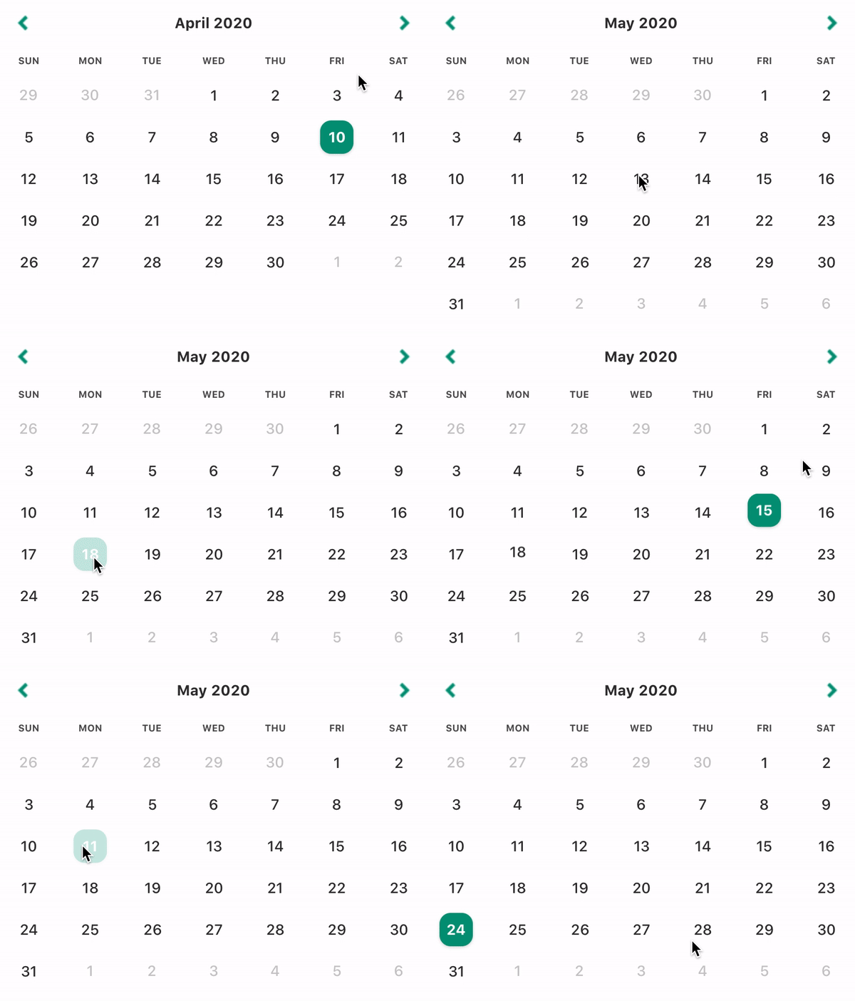
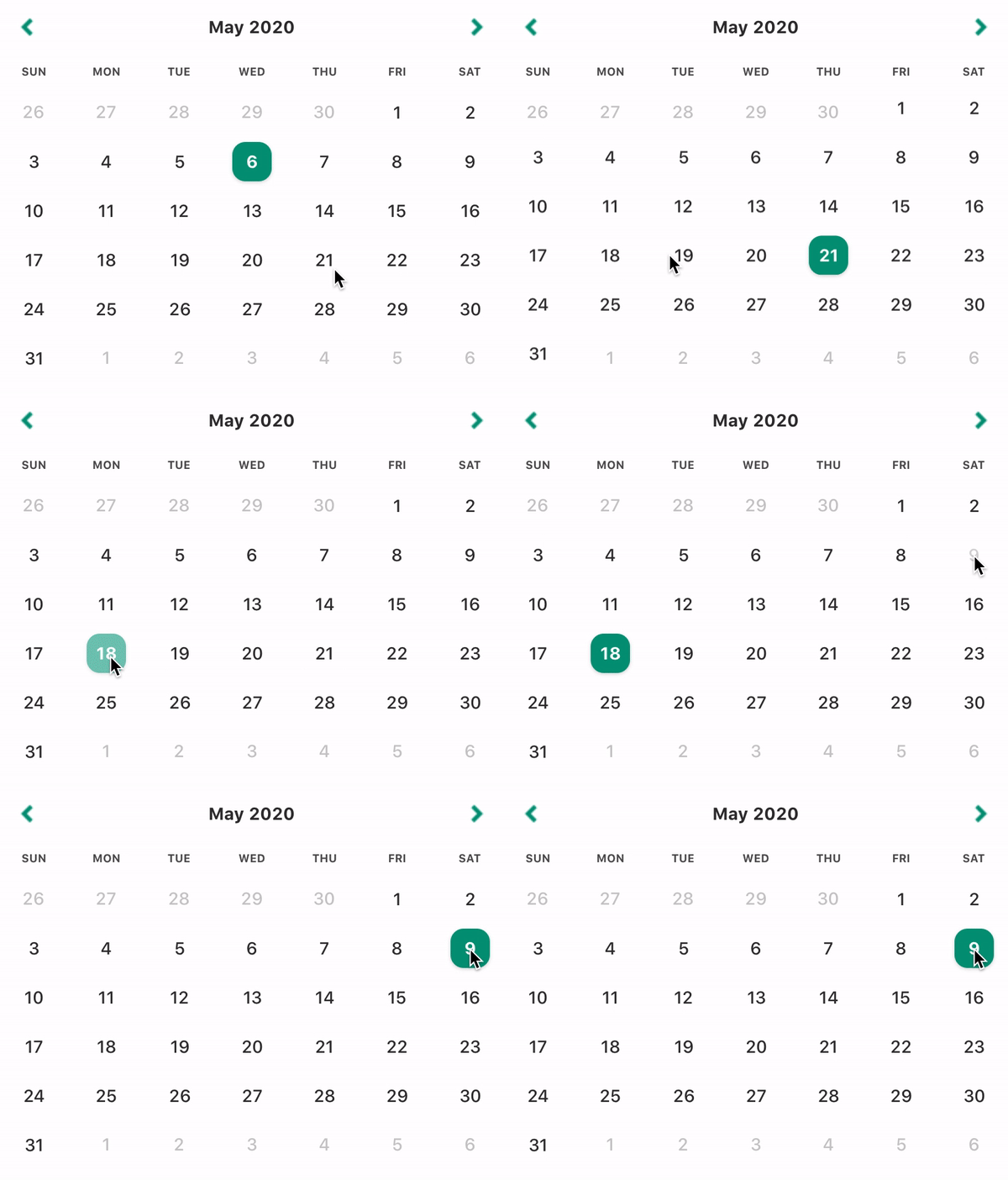
Image on the left is optimized. Image on the right is not.
// Option 1: GOOD
const [selectedDate, setSelectedDate] = React.useState('2020-02-01');

return (
  <DateSelectionCalendar
    locale={CustomLocale};
    onSelectDate={setSelectedDate}
    selectedDate={selectedDate}
  />
);

// Option 2: GOOD
const [selectedDate, setSelectedDate] = React.useState('2020-02-01');
const doSomethingMoreComplicated = React.useCallback((date) => {
  // Some other logic here...
  setSelectedDate(date);
}, []);

return (
  <DateSelectionCalendar
    locale={CustomLocale};
    onSelectDate={doSomethingMoreComplicated}
    selectedDate={selectedDate}
  />
);

// Option 3: BAD
const setSelectedDate = () => setSelectedDate;

return (
  <DateSelectionCalendar
    locale={CustomLocale};
    onSelectDate={setSelectedDate}
    selectedDate={selectedDate}
  />
);

// Option 4: BAD
return (
  <DateSelectionCalendar
    locale={CustomLocale};
    onSelectDate={(date) => setSelectedDate(date)}
    selectedDate={selectedDate}
  />
);
Custom Components
The calendar components' structure or behavior can only be customized by overriding them.
Arrow
Your custom arrows must have the following signature and will receive the following props.export type ArrowComponentType = (props: ArrowProps) => JSX.Element;
export interface ArrowProps {
direction: 'left' | 'right';
isDisabled: boolean;
onPress: () => void;
}
By default, the arrows will be disabled when you've reached the limits imposed by the minDate and maxDate props.
[IMPORTANT]: Remember to call the onPress callback!
import React from 'react';
import { Text, TouchableOpacity } from 'react-native';
import { DateSelectionCalendar, ArrowComponentType } from 'react-native-easy-calendar';

const CustomArrow: ArrowComponentType = React.memo(({ direction, isDisabled, onPress }) => (
  <TouchableOpacity onPress={onPress} disabled={isDisabled}>
    <Text>{`${direction === 'left' ? '<' : '>'}`}</Text>
  </TouchableOpacity>
));

const CustomComponents = () => {
  const [selectedDate, setSelectedDate] = React.useState('2020-07-05');

  return (
    <DateSelectionCalendar
      onSelectDate={setSelectedDate}
      selectedDate={selectedDate}
      ArrowComponent={CustomArrow}
    />
  );
};

export default CustomComponents;
Title
Your custom title must have the following signature and will receive the following props.
export type TitleComponentType = (props: TitleProps) => JSX.Element;

export enum VIEW {
  YEAR,
  MONTH,
}

export interface TitleProps {
  date: string;
  locale: Locale;
  onPress: (date: string) => void;
  isDisabled?: boolean;
  activeView: VIEW;
}
By default, the title will be disabled only when you've passed allowYearView={false}. The activeView will equal either VIEW.YEAR or VIEW.MONTH.
Title date will always be a start-of-month date. The date changes only when the month/year being viewed changes. So it always changes when one of the arrows are pressed, and when a new month is selected in year view. Merely toggling the calendar view DOES NOT cause a change to the date prop! For example:
- If you are viewing Sept 2020 in month view, then
dateis equal toSeptember 01, 2020. - If you then switch to year view, the
datewill still beSeptember 01, 2020. - If you press the right arrow, the
datebecomesSeptember 01, 2021.
The Title component renders both in year view and in month view. By default, Title renders MMMM YYYY in month view and YYYY in year view.
[IMPORTANT]: Remember to call the onPress callback!
import React from 'react';
import { Text, TouchableOpacity } from 'react-native';
import {
  DateSelectionCalendar,
  VIEW,
  TitleComponentType,
} from 'react-native-easy-calendar';

const CustomTitle: TitleComponentType = React.memo(
  ({ date, onPress, isDisabled, activeView, locale }) => {
    const _onPress = React.useCallback(() => onPress(date), [date, onPress]);
    const _date = dayjs(date).locale(locale);

    return (
      <TouchableOpacity onPress={_onPress} disabled={isDisabled}>
        <Text>
          {activeView === VIEW.MONTH
            ? `${_date.format('MMMM YYYY')}`
            : `${_date.format('YYYY')}`}
        </Text>
      </TouchableOpacity>
    );
  }
);

const CustomComponents = () => {
  const [selectedDate, setSelectedDate] = React.useState('2020-07-05');

  return (
    <DateSelectionCalendar
      onSelectDate={setSelectedDate}
      selectedDate={selectedDate}
      TitleComponent={CustomTitle}
    />
  );
};

export default CustomComponents;
Weekdays
Your custom weekdays must have the following signature and will receive the following props.export type WeekdaysComponentType = (props: WeekdaysProps) => JSX.Element;
export interface WeekdaysProps {
days: string[];
}
The days prop is an array of strings resulting from a call to locale.weekdaysShort().
import React from 'react';
import { Text, View } from 'react-native';
import {
  DateSelectionCalendar,
  VIEW,
  WeekdaysComponentType,
} from 'react-native-easy-calendar';

const CustomWeekdays: WeekdaysComponentType = React.memo(({ days }) => (
  <View style={styles.weekdaysContainer}>
    {days.map((day, index) => (
      <Text key={index} style={styles.weekdayText}>
        {day.toLocaleUpperCase()}
      </Text>
    ))}
  </View>
));

const CustomComponents = () => {
  const [selectedDate, setSelectedDate] = React.useState('2020-07-05');

  return (
    <DateSelectionCalendar
      onSelectDate={setSelectedDate}
      selectedDate={selectedDate}
      WeekdaysComponent={CustomWeekdays}
    />
  );
};

export default CustomComponents;
Month
The month component is the component that is rendered 12 times in `VIEW.YEAR`. Your custom months must have the following signature and will receive the following props.export type MonthComponentType = (props: MonthProps) => JSX.Element;
export interface Props {
date: string;
locale: Locale;
onPress: (date: string) => void;
isSelected: boolean;
isDisabled: boolean;
}
By default, a month will be disabled when you've reached the limits imposed by the minDate and maxDate props. A month will be selected when the selectedDate prop belongs to that month. Month date will always be a start-of-month date. In the case of September 2020, for example, the date is equal to September 01, 2020. In pretty much all cases, this knowledge is irrelevant because you'll want to render only the month, not the date.
The Month component renders only in year view. By default, Month renders MMM format.
[IMPORTANT]: Remember to call the onPress callback!
import React from 'react';
import { Text, TouchableOpacity } from 'react-native';
import {
  DateSelectionCalendar,
  VIEW,
  MonthComponentType,
} from 'react-native-easy-calendar';

const CustomMonth: MonthComponentType = React.memo(
  ({ date, onPress, isDisabled, locale }) => {
    const _onPress = React.useCallback(() => onPress(date), [date, onPress]);

    return (
      <TouchableOpacity
        style={styles.monthContainer}
        onPress={_onPress}
        disabled={isDisabled}>
        <Text>{dayjs(date).locale(locale).format('MMM')}</Text>
      </TouchableOpacity>
    );
  }
);

const CustomComponents = () => {
  const [selectedDate, setSelectedDate] = React.useState('2020-07-05');

  return (
    <DateSelectionCalendar
      onSelectDate={setSelectedDate}
      selectedDate={selectedDate}
      MonthComponent={CustomMonth}
    />
  );
};

export default CustomComponents;
Day
The day component is the component that is rendered 28 to 31 times in `VIEW.MONTH`. Your custom days must have the following signature and will receive the following props.export type DayComponentType = (props: DayProps) => JSX.Element;
interface OtherProps {
date: string;
onPress: (date: string) => void;
// Used in date selection calendar
isSelected: boolean;
// Used in both calendars
isDisabled: boolean;
isStartOfWeek: boolean;
isEndOfWeek: boolean;
isStartOfMonth: boolean;
isEndOfMonth: boolean;
isExtraDay: boolean;
showExtraDates: boolean;
}
The date prop is null only when isExtraDay === true && showExtraDates === false. By default, the day is disabled when it is included in the disabledDates prop, when you've reached the limits imposed by the maxDate and minDate props, or when isExtraDay == true.
[IMPORTANT]: Remember to call the onPress callback!
import React from 'react';
import { Text, TouchableOpacity } from 'react-native';
import { SingleDateSelectionCalendar, DayComponentType } from 'react-native-easy-calendar';

const CustomDay: DayComponentType = React.memo(({ date, onPress, isDisabled }) => {
  const _onPress = React.useCallback(() => onPress(date), [date, onPress]);

  return (
    <TouchableOpacity onPress={_onPress} disabled={isDisabled} style={styles.dayContainer}>
      <Text>{dayjs(date).date()}</Text>
    </TouchableOpacity>
  );
});

const CustomComponents = () => {
  const [selectedDate, setSelectedDate] = React.useState('2020-07-05');

  return (
    <SingleDateSelectionCalendar
      onSelectDate={setSelectedDate}
      selectedDate={selectedDate}
      DayComponent={CustomDay}
    />
  );
};

export default CustomComponents;
Calendars
Single Date Selection Calendar

This calendar supports only the selection of a single date. It has also been aliased as DateSelectionCalendar, if you prefer. You may pass a date string in YYYY-MM-DD format as the initial value of selectedDate, or an empty string to indicate that no date has been initially selected. Clicking on a date selects it, and this date can only be deselected by selecting another date.
import { DateSelectionCalendar, DefaultTheme } from 'react-native-easy-calendar'
import frenchLocale from 'dayjs/locale/fr';

const Example = () => {
  const [selectedDate, setSelectedDate] = React.useState<string>('2020-02-01');
  const [selectedDate, setSelectedDate] = React.useState<string>(''); // Also possible

  return (
    <DateSelectionCalendar
      {/* The following props are optional */}
      disabledDates={['2020-01-01', '2020-03-04']}
      initVisibleDate={'2020-02-10'} // defaults to selectedDate
      minDate={'2020-01-10'};
      maxDate={'2020-04-10'};
      allowYearView={true};
      showExtraDates={false};
      testID={'my-calendar-component'};
      locale={frenchLocale}; // defaults to en-CA
      theme={DefaultTheme};
      {/* The following props are required */}
      onSelectDate={setSelectedDate}
      selectedDate={selectedDate}
    />
  );
};
Multi Date Selection Calendar
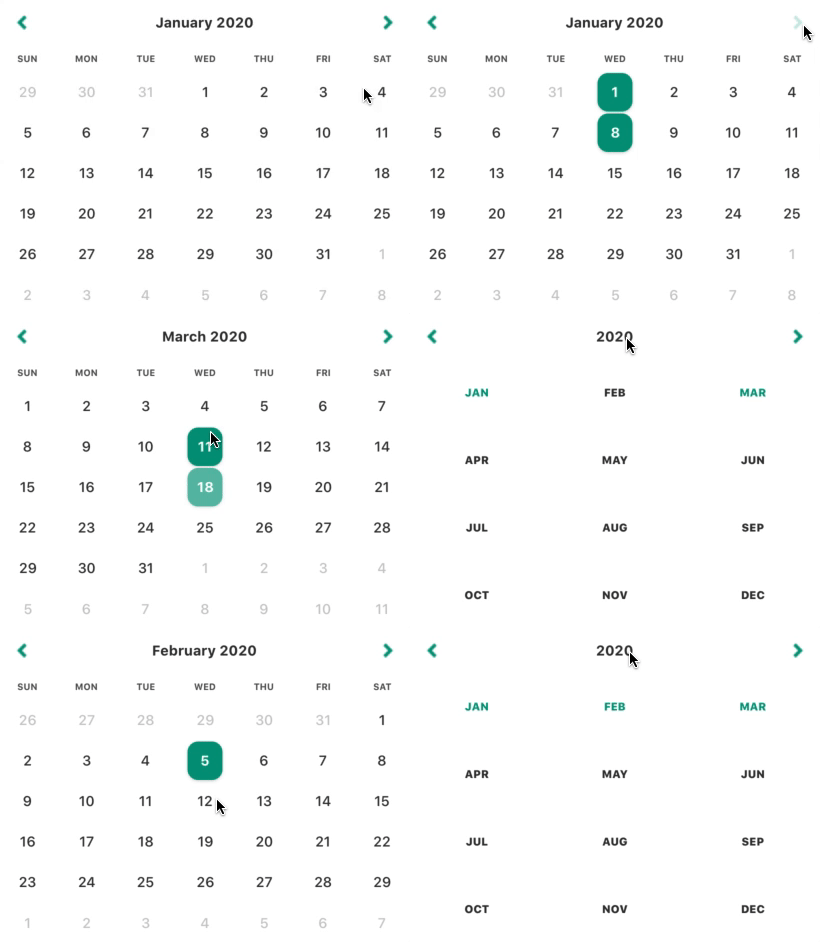
This calendar supports the selection of multiple dates. Notice that, unlike the SingleDateSelectionCalendar, this calendar works with arrays of strings. Clicking on a date selects it, clicking it again deselects it. You can provide an empty array as the initial value of selectedDates, or provide an array already populated with one or more dates. The calendar is a controlled component, so you have the power to limit the number of dates that can be selected in your onSelectDates callback.
import { MultiDateSelectionCalendar, DefaultTheme } from 'react-native-easy-calendar'
import frenchLocale from 'dayjs/locale/fr';

const Example = () => {
  const [selectedDates, setSelectedDates] = React.useState<string[]>([]);
  const [selectedDates, setSelectedDates] = React.useState<string[]>(['2020-01-01']); // Also possible


  const setMaxNumberOfSelectedDates = React.useCallback((_selectedDates: string[]) => {
    const MAX_DATES = 3;
    if (_selectedDates.length <= MAX_DATES) {
      setSelectedDates(_selectedDates)
    }
  })

  return (
    <MultiDateSelectionCalendar
      {/* The following props are optional */}
      disabledDates={['2020-01-01', '2020-03-04']}
      initVisibleDate={'2020-02-10'} // defaults to current date
      minDate={'2020-01-10'};
      maxDate={'2020-04-10'};
      allowYearView={true};
      showExtraDates={false};
      testID={'my-calendar-component'};
      locale={frenchLocale}; // defaults to en-CA
      theme={DefaultTheme};
      {/* The following props are required */}
      onSelectDates={setMaxNumberOfSelectedDates}
      selectedDates={selectedDates}
    />
  );
};
Contributing
Contributors welcome! See the contributing guide to learn how to contribute to the repository and the development workflow.
License
MIT

