README
CheckBoxGroup is not just a checkbox, it is a Grouped checkbox
install
npm install react-native-checkboxgroup
API
this lib only expose one default component called CheckBoxGroup , it treats each child as an checkbox option.
it self also has a feature to toggle all the options at a time.
the typical usage is the shopping cart like Tmall or JD.
below is the example:
import CheckBoxGroup from "react-native-checkboxgroup"

<CheckBoxGroup>
    <Text key="B">this is a simplest checkbox item</Text>
    <View key="CC">
        this is more complex checkbox item
    </View>
    <CustomComp key="BBB">also any custom UI can be a checkbox item</CustomComp>
</CheckBoxGroup>
in this example there are 3 checkbox options in one group .each option has an interactive indicator telling whether it is selected or not .
The indicator is highly customizable, also the layout of the item is customizable by rowTemplate
indicator by default is   on/off
|____________________________________
| ⬛️ |     here is the group title  |----------> title Bar is consist of the title and indicator
|___________________________________________
| ⬛️ |  this is a simplest checkbox item		|-----> option item is consist of the indicator and a child ui
| ⬛️ |  this is more complex checkbox item	|
| ⬛️ |  also any custom UI can be a checkbox item	|
|________________________________________________
| here is the group footer  |----------> pure UI element no check box available, for tips purpose
|___________________________________________
CheckBoxGroup
***all children in CheckBoxGroup tag MUST have the
keyproperty ,it reuse thekeyprops of react as the item'sid, it tells who is selected. But there is one exception ,that is the outermostCheckBoxGroup, it useidentifieras theidprop but it is optional ***
the Nested
CheckBoxGroup***extends all the customizable props of the fatherCheckBoxGroupby default ,so it means plz do config on top levelCheckBoxGroup***it also support radio mode ,under this mode plz don't nest
CheckBoxGrouptoo deep, more then 2 depth is not predictable .
| property | signature | description |
|---|---|---|
| identifier?: string; | the id of the outermost CheckBoxGroup | |
| mode?:"RadioGroupMode" | switch on the radio mode ,the toggle api of CheckBoxGroup doesn't work of under this mode ,it makes sense, also the indicator of the group is not visible |
|
| isGroupTitleBarVisiable?:boolean; | should show the title bar of the group ,default true |
|
| renderTitle?:()=>React.ReactElement |
customize the title of the group | |
| renderCheckBox?: (isSelected: boolean) => ReactElement |
customize the indicator UI | |
| rowTemplate?: (checkbox: ReactElement |
customize the layout of one option item,PARAMS=> checkbox the customized indicator rendered by renderCheckBox if exist, or on/off by default ,PARAMS=>item:CheckBoxGroup the child ui (UI in CheckBoxGroup tag),PARAMS=>key:the id of the option item |
|
| onChange?:(k:SelectedStatus)=>void; | the select status (include the nested childrens' status) changed by user |
| Method | Desc |
|---|---|
| getSelectedValue(isFilterFalse:boolean=true):SelectedStatus | use this to get the group status manually,by default it only return the selected option items,by setting isFilterFalse to false to get all option status no matter selected or not |
| toggle(trueOrFalse?:boolean): void; | select all or deselect all option of a group |
Examples
| Case | Code | Gif |
|---|---|---|
| simple Exam | SimpleExample | 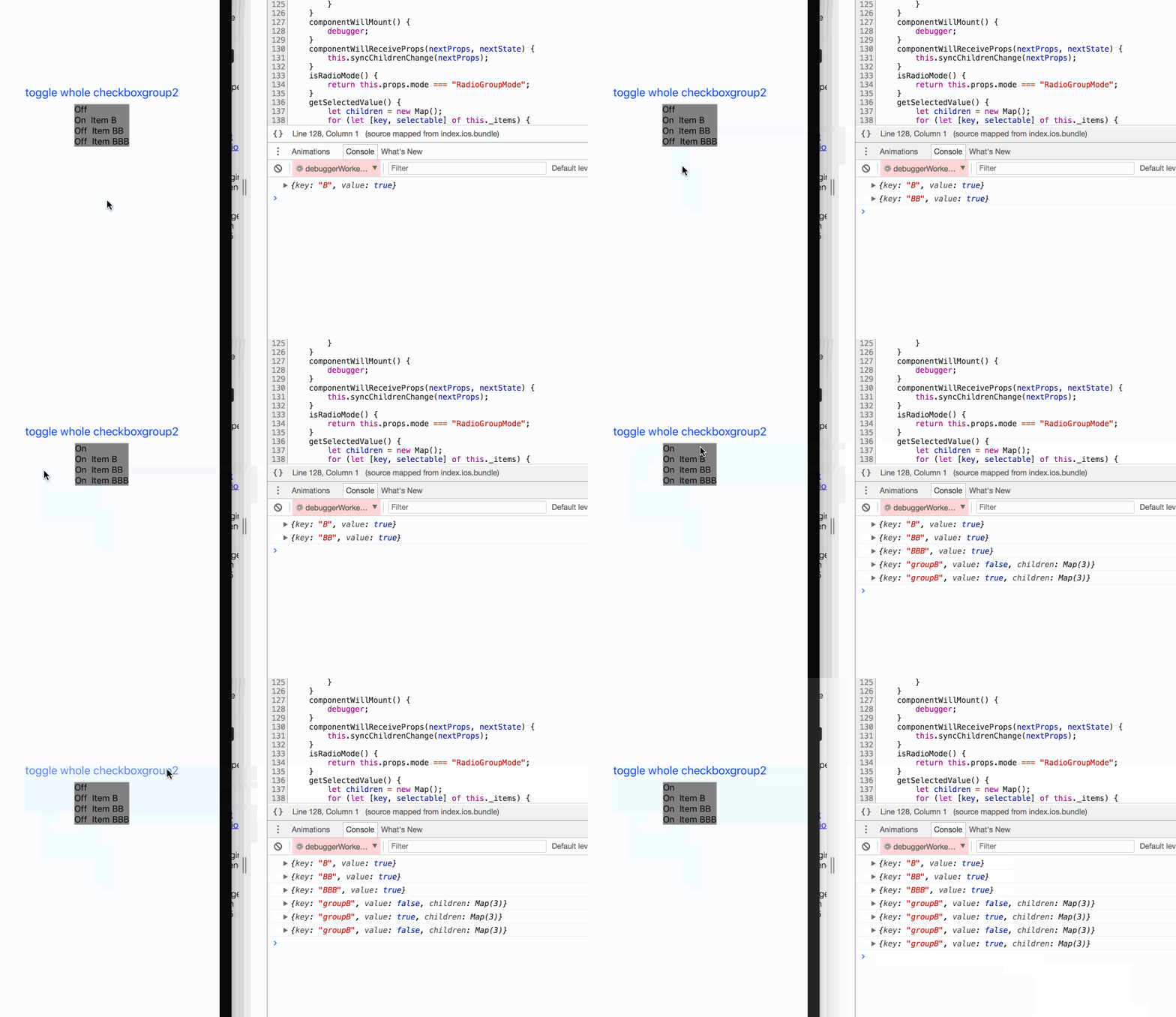 |
| Nest Group Exam | SimpleNestExample | 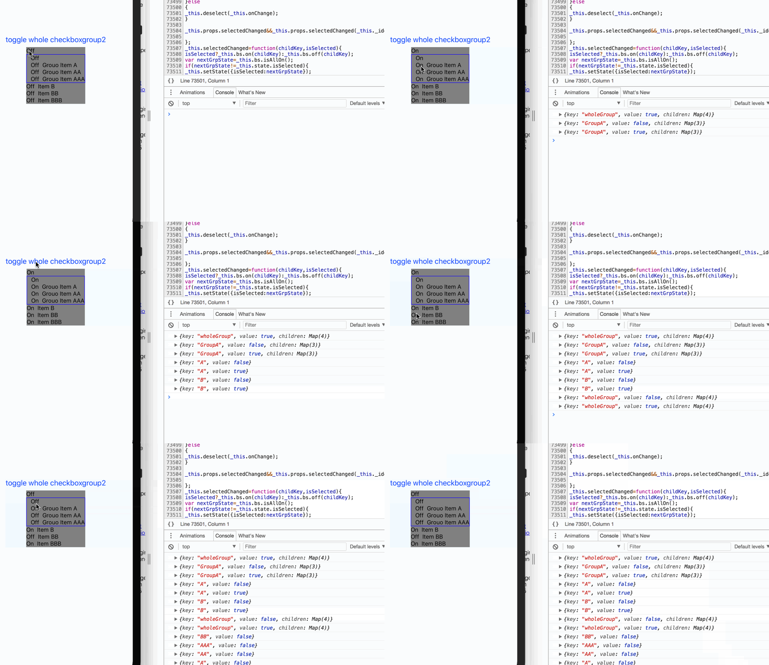 |
| Customize Group Exam | CustomizeExample | 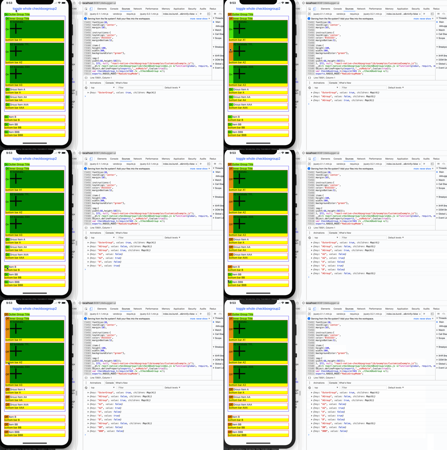 |
| Add/Del option Item Dynamic Exam | DynamicItemExample | 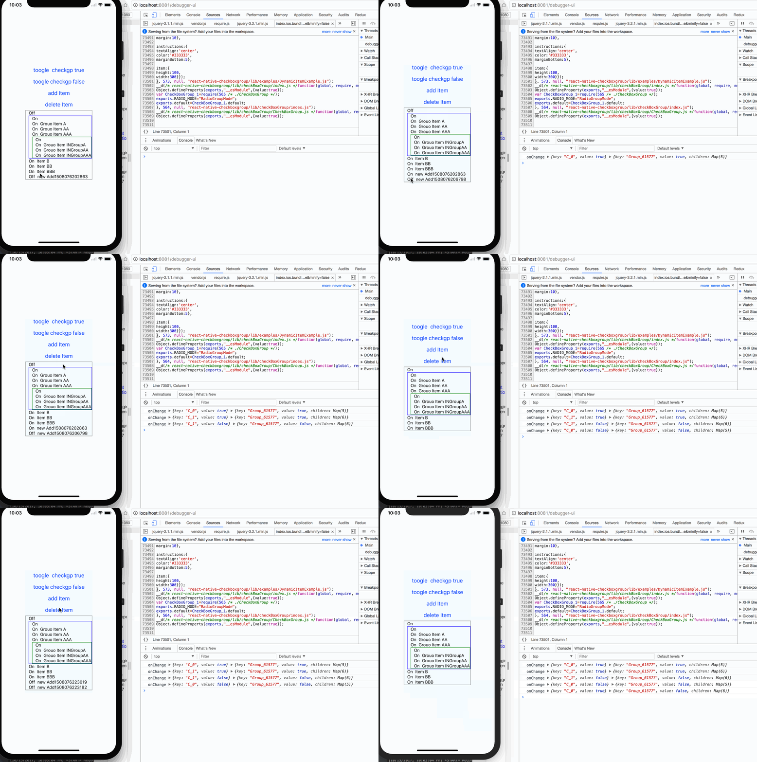 |
| Radio Mode Eaxm | RadioGroupMode | 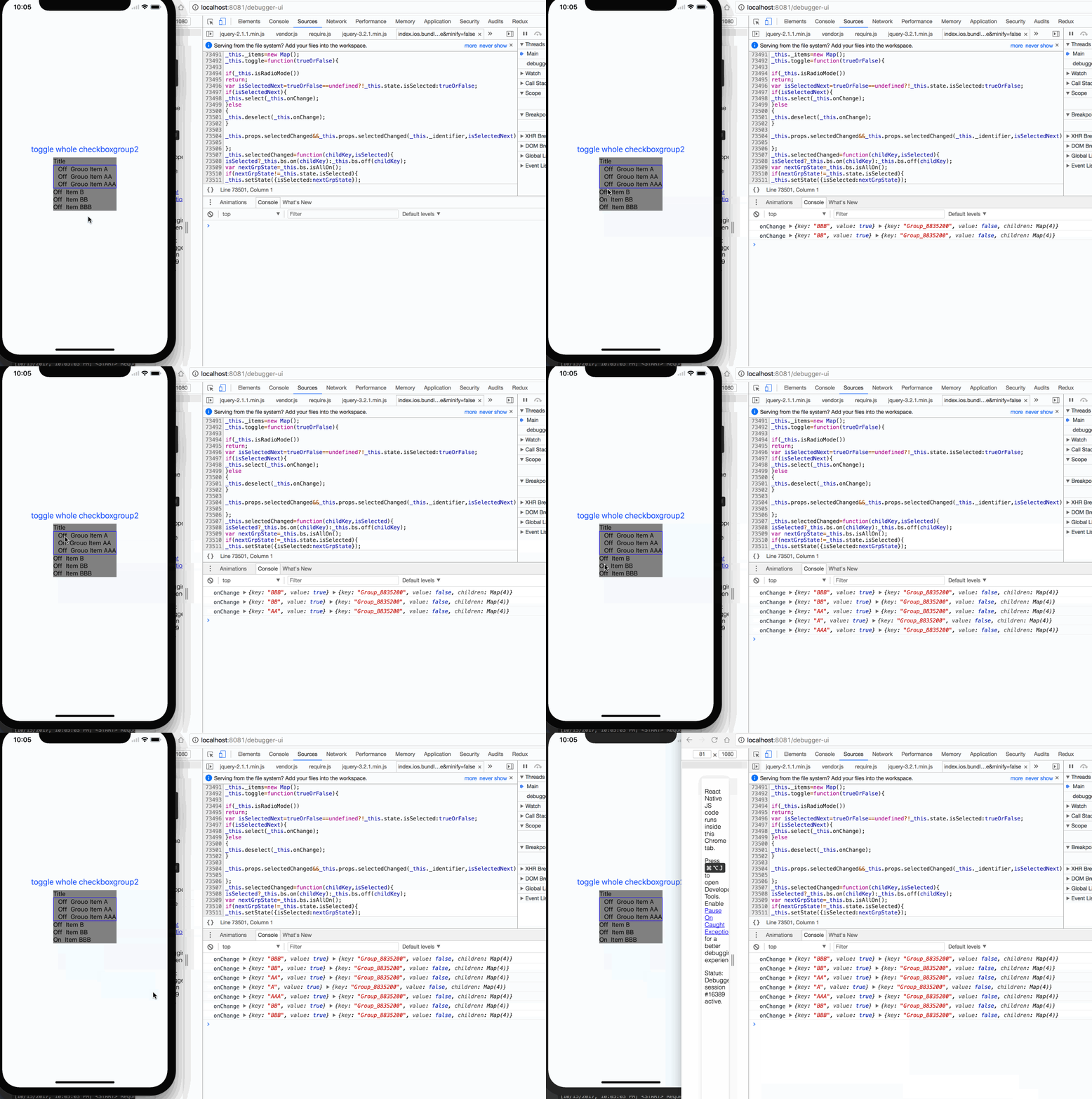 |