README
React-Millercolumns
Lightweight, responsive and configurable React version of miller columns
React-Millercolumns helps you create tree viewers!
- The React-Millercolumns only cares how many
Columncomponents passed in viaprops.childrenand updates UI. It doesn't care what contents we render. - You have a control over how to use the component.
Basic example
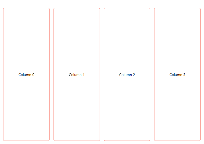
import { MillerColumns, Column } from './MillerColumns';

const Row = (props) => {
  const style = {
    transition: 'background 200ms',
    background: props.peekColumn && !props.transitioning
      ? '#bae6f9'
      : '',
    height: '500px',
    border: '1px solid salmon',
    borderRadius: '5px',
    display: 'flex',
    fontSize: '14px',
    flexDirection: 'column',
    justifyContent: 'center',
  }
  return (
    <div
      onClick={props.peekColumn
        ? props.onRemove
        : props.onAdd}
      style={style}>
      Column {props.currentIndex}
    </div>
  );
}

class App extends React.Component {
  constructor(props) {
    super(props);
    this.state = {
      count: 4,
    }
    this.inc = this.inc.bind(this);
    this.dec = this.dec.bind(this);
  }

  inc() {
    this.setState({
      count: ++this.state.count,
    })
  }

  dec() {
    this.setState({
      count: --this.state.count,
    })
  }

  getColumns() {
    let arr = [];
    for (let i = 0; i < this.state.count; i++) {
      arr.push(<Column key={i}>
        <Row
          onAdd={this.inc}
          onRemove={this.dec}
          currentIndex={i} />
      </Column>)
    }
    return arr;
  }

  render() {
    return (
      <div style={{marginTop: '50px'}} className="App">
          <MillerColumns
            maxColumn={5}
            minColumnWidth={150}
            maxColumnWidth={200}
            columnMagin={30}
            peekWidth={30}
          >
            {
              this.getColumns()
            }
          </MillerColumns>
      </div>
    );
  }
}
Advanced example

The full source code is availble at /src/sample
import { MillerColumns, Column } from './MillerColumns';
import sampleTree from './sample/sampleTree';
import Model from './sample/model';
import Row from './sample/Row';

class App extends React.Component {
  constructor(props) {
    super(props);
    this.state = {
      tree: new Model(sampleTree)
    }
    this.onRowClick = this.onRowClick.bind(this);
  }

  onRowClick(label) {
    this.state.tree.FindAndSetSelected(label);
    this.setState({
      tree: this.state.tree,
    })
  }

  getColumn(tree, index) {
    return (
      <Column key={index}>
        <Row onRowClick={this.onRowClick} tree={tree} />
      </Column>
    )
  }

  getColumns(tree, columns = [], localIndex = 0) {
    let index = localIndex || 0;
    columns.push(this.getColumn(tree, index));
    if (!tree.selectedChild) return columns;
    return this.getColumns(tree.NextNode, columns, ++localIndex);
  }

  render() {
    return (
      <div style={{ marginTop: '50px' }} className="App">
        <MillerColumns
          maxColumn={4}
          minColumnWidth={150}
          columnMagin={35}
          peekWidth={35}
        >
          {
            this.getColumns(this.state.tree)
          }
        </MillerColumns>
      </div>
    );
  }
}
Api
MillerColumns
| Props | Type | Description | Required |
|---|---|---|---|
| maxColumn | Number | Maximum number of visible columns | Yes |
| minColumnWidth | Number | Minimum width of each column | Yes |
| columnMagin | Number | Margin between columns | Yes |
| peekWidth | Number | Width of the Peek column | Yes |
| children | Array | Array of Column component |
Yes |
| animationSpeed | Number | Animation speed of moving columns | No |
Column
| Props | Type | Description | Required |
|---|---|---|---|
| style | Object | style object Column |
No |
Each of your content component needs to be wrapped with Column component so that it can access the following via props
| Name | Type | Description |
|---|---|---|
| peekColumn | Boolean | Indicates if the column is the peek column |
| transitioning | Boolean | Indicates if the millercolumn is being resized or a number of columns being updated |
| column | Object | Instance of ColumnMover class, details below |
column object passed via props is mostly internal use. however some of properties can be useful
| Name | Type | Description |
|---|---|---|
| totalWidth | Number | Current width of Millercolumns |
| maxColumnWidth | Number | Current width of column |
| marginRight | Number | Current margin of column |
| shouldShowPeek | Boolean | Indicates if Millercolumns should show the peek column |
| peekIndex | Number | Current index of peek column |
| visibleColumns | Number | Current number of visible columns |