README
Doing a React POC or building a production application? react-message-block is an easy to use package for showing success/error/warn/info/custom message blocks.
Features
- Lightweight
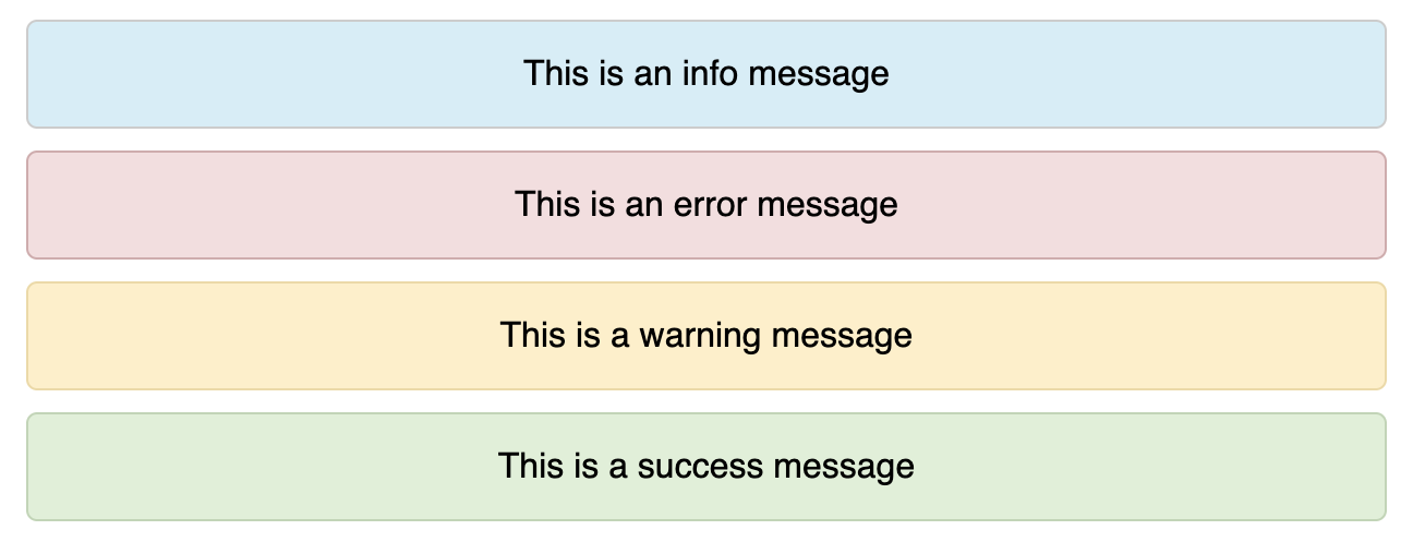
- Out of the box message stylings
- Custom Styling Options

Installation
With Yarn
yarn add react-message-block
With npm
npm i --save react-message-block
Documentation
You could view the documentation in Github Page as well.
Usage
react-message-block is compatible with both Class and Functional React Components.
Basic Usage
import Message from 'react-message-block';
const App = () => {
    return (
        <div>
            <Message text = {'Congrats! You have installed this plugin'} />
        </div>
    )
}
Available Custom Props
By default, react-message-block comes up with the following properties. You could use the following to customize your message block out of the box.
| Prop | Optional | Default | Possible Values | Description |
|---|---|---|---|---|
| text | Yes | Any String | Display Message | |
| type | Yes | info | plain | info | success | error | warn | To show Loading Message |
| onClose | Yes | Callback func | Callback function to close the message block. Close Icon will appear along with the message block | |
| style | Yes | Custom Style Object | To apply user defined styles | |
| align | Yes | center | center | left | right | To align message text |
Example
Custom HTML Layout
Not happy with the one line message? You could always pass children within the Message component to display your custom message layout.
<Message type = 'info'>
    <h4>Message Heading</h4>
    <p>This is the message body</h4>
</Message>
<Message type = 'error'>
    <h4>Please check the following fields</h4>
    <ul>
      <li>Email is not valid</li>
      <li>Password and Confirm Password does not match</li>
      <li>Phone Number is already registered</li>
    </ul>
</Message>
onClose
Many times, you would want to provide the feasibility of dismissing a message block. You could achieve it by passing onClose callback function as prop to the component.
<Message
  text = 'Something went wrong'
  type = 'error'
  onClose = {handleClose}
>
No Background! Just the message
Want to show just the message without a background? Use type="plain
In most projects, you would want to use this while showing "No Content Messages"
<Message
  text = 'No Content Available'
  type = 'plain'
  onClose = {handleClose}
>
What's Coming Up
- Icon for Messages
- Auto Hiding Message after N seconds
Author
Nijin Vinodan