README
React-based data/field mapping Component
English | 简体中文

✨ Features
- support for custom field attributes
- support custom table name
- support field connection number limit
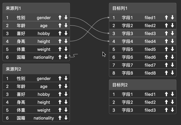
- support field sorting
- support delay rendering, automatic adaptation of height and width, blank padding around
- support custom empty field content
🔨QUCIK DEMO LOCAL
git clone git@github.com:aliyun/react-data-mapping.git
npm install
cd example
npm install
npm start
📦 Install
npm install react-data-mapping
API:
DataMapping属性
| Property | Description | Type | Default |
|---|---|---|---|
| width | Component width | number | Default 500, you can set "auto" for adaptive |
| height | Component height | number | Default 500, you can set "auto" for adaptive |
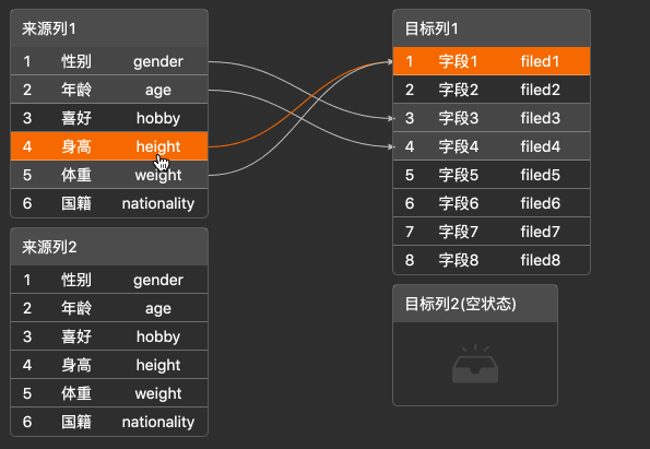
| type | mapping type | string | single | mutiply, default single |
| className | Component className | string | - |
| sourceClassName | Source table className | string | - |
| targetClassName | Target table className | string | - |
| columns | Column props | Columns | Array<Columns> | undefined |
| sourceData | Source table data | SourceData | Object | Array<SourceData> | undefined |
| targetData | Target table data | TargetData | Object | Array<TargetData> | undefined |
| mappingData | Init mapping data, mappingData Prop | array | [ ] |
| emptyContent | Show content when table field is empty | string | ReactNode | - |
| emptyWidth | Table container width when table field is empty, config Prop | string | number | 150 |
| config | The extra configuration of components,please reviewe the detailed API below | object | {} |
| isConnect | Event triggered before each edge connection to determine whether it can be connected | function(edge): boolean | |
| onChange | Event triggered by connection | function | |
| onRowMouseOver | Event triggered when the mouse moves onto a row of data | function(row) | |
| onRowMouseOut | Event triggered when the mouse moves out of a row of data | function(row) | |
| onEdgeClick | Event triggered when the connection is clicked | function(row) | |
| readonly | Read only | boolean | Default false |
Column
A column describes a data object and is an item in a Columns.
| Property | Description | Type | Default |
|---|---|---|---|
| key | The path of column data in a data item | string | - |
| title | The column header displays text | string | - |
| width | The column width | number | - |
| primaryKey | Whether this property is uniquely identified for the set of data | boolean | 必须且仅有一个属性为true |
| render | Custom rendering function, parameters are the value of the current row, the current row data, row index | function(text, record, index) {} | - |
sourceData
Source table data,when type is single , the sourceData type is { }; when type为 mutiply , the sourceData type is [ ].
| Property | Description | Type | Default |
|---|---|---|---|
| id | Column identifies, when type is single,the id is not required, when the type is mutiply, the id is required |
string | - |
| title | Column title | string | - |
| fileds | Data record array to be displayed | array | - |
| checked | Is it checked | boolean | false |
| disable | No connection | boolean | false |
targetData
Target table data, when type is single , the targetData type is { }, when type is mutiply , the targetData type is [ ], Please check sourceData
mappingData
| Property | Description | Type |
|---|---|---|
| source | Unique identification of the current row data in the source table | - |
| target | Unique identification of the current row data in the target table | - |
| sourceNode | The ID of the source table, Please check sourceData ID | string |
| targetNode | The ID of the target table, Please check targetData ID | string |
config
The extra configuration of components
| Property | Description | Type | Default |
|---|---|---|---|
| delayDraw | Delayed rendering. This component must ensure that the canvas container rendering (including animation execution) is completed before rendering, otherwise the coordinates will be offset, for example:Animation of Ant Design Modal | number | 0 |
| extraPos | Padding is reserved when rendering the canvas | extraPos Prop { } | - |
| sortable | Sorter | boolean | object | - |
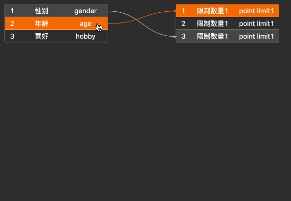
| linkNumLimit | Number of lines limited | number | object | - |
| checkable | Support check box | checkable Prop { } | - |
extraPos
Padding is reserved when rendering the canvas
| Property | Description | Type | Default |
|---|---|---|---|
| paddingLeft | Padding spacing on the left | number | 0 |
| paddingRight | Padding spacing on the right | number | 0 |
| paddingTop | Padding spacing on the top | number | 0 |
| paddingBottom | Padding spacing on the bottom | number | 0 |
| paddingCenter | Center spacing | number | 150 |
checkable
Table supports checkbox
| Property | Description | Type | Default |
|---|---|---|---|
| source | left table supports checkbox | boolean | false |
| target | right table supports checkbox | boolean | false |
🔗API
interface columns { // setting the attributes of each column
  title ? : string; // the title of each column, similar to the concept of thead
  key: string; // the unique mark of each column, corresponding to the key value on the data
  width ? : number; // width of each column
  primaryKey: boolean // whether the value corresponding to the key in this column is used as a unique sign
  render?(text: any, record: any, index: number): void; // Custom rendering function
}

interface config {
  delayDraw: number; // Delayed rendering, this component must ensure that the canvas container rendering (including animation execution) is completed before rendering, otherwise the coordinates will be offset, such as: antd's modal animation
  extraPos ? : { // Padding is reserved when the canvas is rendered
      paddingLeft ? : number,
      paddingRight ? : number,
      paddingTop ? : number,
      paddingBottom ? : number,
      paddingCenter ? : number,
    },
    sortable ? : boolean | { // Sorting support, if it is true, the canvas will support sorting
      source ? : boolean, // If it is true, only the left source table supports sorting
      target ? : boolean // If it is true, only pure right target table supports sorting
    },
    linkNumLimit ? : number | { // Connection Number support, if it is number, the canvas supports n connections
      source ? : number, // If it is number, only the left source table supports n connections
      target ? : number // If it is number, only the left target table supports n connections
    },
    checkable ?: {  // table supports checkbox
      source ? : boolean, // // If it is true, only pure right target table supports checkbox
      target ? : boolean
    }
}

interface ComProps { // component props
  width ? : number; // component width
  height ? : number; // component height
  type ? : string; // "single"or"mutiply", single-table mapping (above pic one) or multi-table mapping (above pic two)
  className ? : string; // component className
  sourceClassName ? : string; // source table className
  targetClassName ? : string; // target table className
  columns: Array < columns > ; // please refer to the above interface columns
  sourceData: Array < any > | Object; // single-table mapping corresponds to Object, multi-table mapping Array, please refer to demo
  targetData: Array < any > | Object; // single-table mapping corresponds to Object, multi-table mapping Array, please refer to demo
  mappingData: Array < any > ; // initialize correspondence data, please refer to demo
  emptyContent ? : string | JSX.Element; // show content when table field is empty
  emptyWidth ? : number | string; // table container width when table field is empty
  isConnect?(edge: any): boolean; // isConnect event is triggered before you connect an edge, return true, it will connect, and false will not
  onChange(data: any): void // onChange event is triggered every time you connect edge
  onRowMouseOver?(row:any):void, // onRowMouseOver event is triggered when you move the cursor onto a row of data
  onRowMouseOut?(row:any):void, // onRowMouseOver event is triggered when you move the cursor out of a row of data
};
import ButterflyDataMapping from 'react-data-mapping';
import 'react-data-mapping/dist/index.css';

<ButterflyDataMapping
  width={500}
  height={1000}
  type={'single'}
  columns={columns}
  sourceData={sourceData}
  targetData={targetData}
  mappingData={mappingData}
  className={'butterfly-data-mapping'}
  sourceClassName={'source-column'}
  targetClassName={'target-column'}
/>
If you need more customized requirements, you can refer to issue or butterfly to customize your needs