README
React Boxen
A layout primitive for React.
React Boxen utilizes Styled Components to provide cross-browser layout.
Why?
- Flex Box Plus - Provides a helpful layer of abstraction on top of the robust (and sometimes confusing) display flex properties
- Child spacing - Provides consistent spacing between child elements vertically, horizontally, and wrapping
Installation
npm install react-boxen --save or yarn add react-boxen
Usage Examples
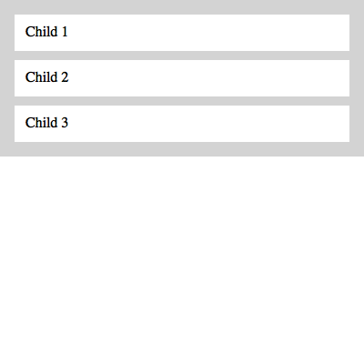
Spacing vertically
This example produces a layout with each child spaced vertically.

import React from "react"
import Box from "react-boxen"

const css = {
  parent: `
    padding: 1em;
    background: lightgray;
  `,
  child: `
    padding: 0.75em;
    background: white;
  `
}

export default () =>
  <Box
    css={css.parent}
    childSpacing="10px">
    <Box css={css.child}>Child 1</Box>
    <Box css={css.child}>Child 2</Box>
    <Box css={css.child}>Child 3</Box>
  </Box>
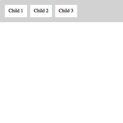
Spacing horizontally
This example produces a layout with each child spaced horizontally.

import React from "react"
import Box from "react-boxen"

const css = {
  parent: `
    padding: 1em;
    background: lightgray;
  `,
  child: `
    padding: 0.75em;
    background: white;
  `
}

export default () =>
  <Box
    css={css.parent}
    childDirection="row"
    childSpacing="10px">
    <Box css={css.child}>Child 1</Box>
    <Box css={css.child}>Child 2</Box>
    <Box css={css.child}>Child 3</Box>
  </Box>
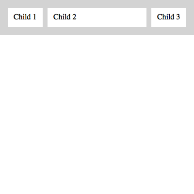
Child grow
When a child receives grow as a prop (or data-grow for native elements) it fills the available space.

import React from "react"
import Box from "react-boxen"

const css = {
  parent: `
    padding: 1em;
    background: lightgray;
  `,
  child: `
    padding: 0.75em;
    background: white;
  `
}

export default () =>
  <Box
    css={css.parent}
    childDirection="row"
    childSpacing="10px">
    <Box css={css.child}>Child 1</Box>
    <Box grow css={css.child}>Child 2</Box>
    <Box css={css.child}>Child 3</Box>
  </Box>
API
Box Properties
Properties placed on the Box component directly.
| Property | Type | Value (default *) |
Description |
|---|---|---|---|
css |
String | Template literal containing valid CSS | See styled-components documentation |
childAlign |
String | flex-start * flex-end center stretch baseline |
Align children along the cross axis |
childBasis |
String | Length | Assigns flex-basis on children |
childDirection |
String | column * column-reverse row row-reverse |
Vertical or horizontal orientation of children |
childJustify |
String | flex-start * flex-end center space-between space-around |
Align children along the main axis |
childWrap |
String | nowrap * wrap wrap-reverse |
Define whether or not children can wrap |
childWrapLastGrow |
Bool | True * |
Setting to false preserves any orphan element's width when childWrap is wrap. |
childSpacing |
String | Length | Spacing between children on any axis (accepts shorthand value 5px 10em) |
padding |
String | Length | Accepts shorthand 5px 10em |
...rest |
Any | Any | Rest of props (aside from children) are spread onto Box itself (e.g. onClick, onPress, etc.) |
Child Properties
Properties added to any direct child. For compound components use values as shown. For native elements (e.g. <div />) use data-<grow|shrink|...> (i.e. <div data-grow>Child</div>).
| Property | Type | Value (default *) |
Description |
|---|---|---|---|
basis |
String | Length | Individual flex-basis. This controls the length (width or height) along the main axis. |
grow |
Number | 0 * |
Amount Box should grow to fill available space |
scroll |
Bool | False * |
Sets child wrapper to 100% height and overflow auto |
shrink |
Number | 0 * |
Amount Box should shrink inside available space |
spacerRef |
Func | null * |
A function used to access the reference of the child's wrapping Spacer |
Roadmap
Technically, there is nothing preventing usage with React Native. The web is a more immediate proving ground. As the API solidifies, testing and support will be hammered out for RN. PRs are always welcome!