README
React Battery Gauge
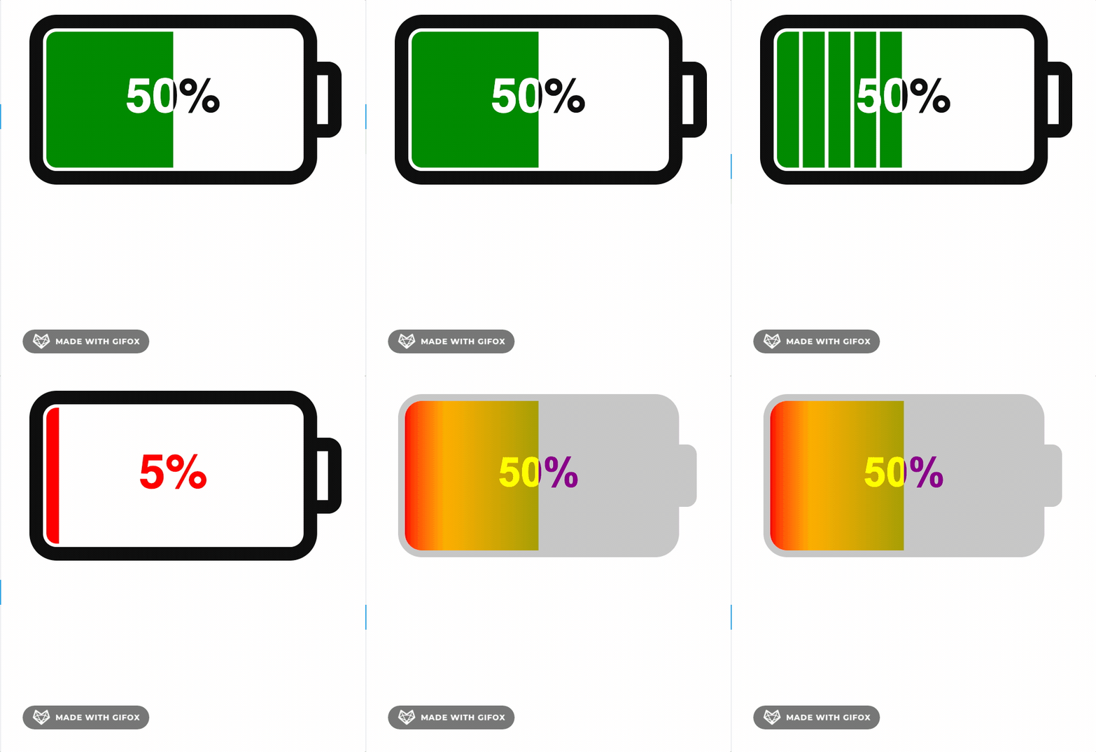
This library is a SVG based react component for displaying battery status, ultra lightweight, highly customizable with zero dependencies
Live Demo
Short Demo

Storybook Demo
Usage
Install it by running
npm install react-battery-gauge # or yarn add react-battery-gauge
Include the component:
import BatteryGauge from 'react-battery-gauge'

<BatteryGauge value={40} />
Options
| Name | Description | Default | type |
|---|---|---|---|
| value | Meter value range [0-maxValue(100)] | 50 | number |
| maxValue | Meter max value | 100 | number |
| orientation | Changes orientation, keeping text horizontal | "horizontal" | "horizontal"| "vertical" |
| padding | Padding of gauge within canvas | 5 | number |
| size | We don't like passing both width and height, can create unusual looking shape. Size will help gauge to achieve the desired size maintaining aspect ratio | 300 | number |
| aspectRatio | Gauge aspect ratio, At padding 0 easy to create battery types -> D = 0.56, C = 0.52, AA = 0.28, AAA = 0.23, AAAA = 0.19 , default C battery | 0.52 | number |
| animated | Enable animation on mount | false | boolean |
| charging | Enable charging mode | false | boolean |
| customization | All individual components customisation | GaugeCustom | Partial |
Override any customization default values:
{
  batteryBody: {
    strokeWidth: 4,
    cornerRadius: 6,
    fill: 'none',
    strokeColor: '#111'
  },
  batteryCap: {
    fill: 'none',
    strokeWidth: 4,
    strokeColor: '#111',
    cornerRadius: 2,
    capToBodyRatio: 0.4
  },
  batteryMeter: {
    fill: 'green',
    lowBatteryValue: 15,
    lowBatteryFill: 'red',
    outerGap: 1,
    noOfCells: 1, // more than 1, will create cell battery
    interCellsGap: 1
  },
  readingText: {
    lightContrastColor: '#111',
    darkContrastColor: '#fff',
    lowBatteryColor: 'red',
    fontFamily: 'Helvetica',
    fontSize: 14,
    showPercentage: true
  },
  chargingFlash: {
    scale: undefined,
    fill: 'orange',
    animated: true,
    animationDuration: 1000
  },
}
License
MIT
Free Software, Your contribution is welcome!