README
Repository includes React version and Vanilla JS adapter for standalone usage


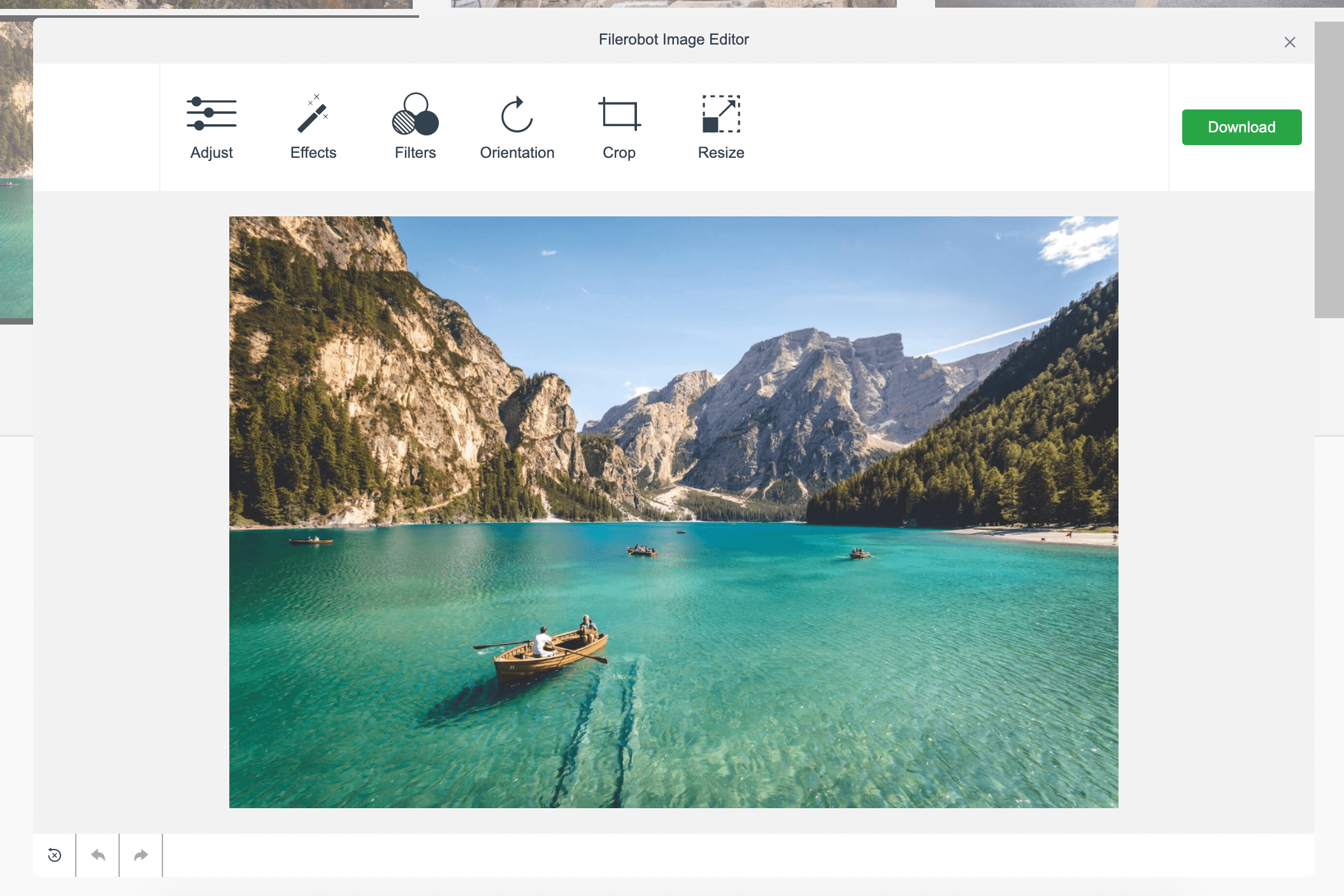
Filerobot Image Editor
Docs • Demo • CodeSandbox • Video tutorial
The Filerobot Image Editor is the easiest way to integrate an easy-to-use image editor in your web application. Integrated with few lines of code, your users will be able to apply basic transformations like resize, crop, rotate and various filters to any image.
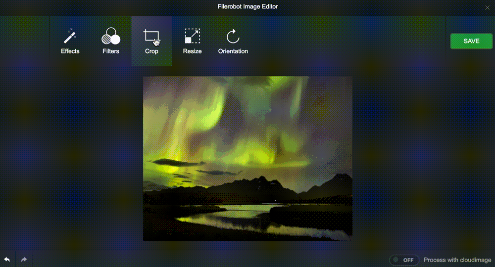
Table of contents
- Features
- Standalone usage
- React component usage
- Configuration
- Filerobot Integration
- Cloudimage Integration
- Roadmap for the near future
- Filerobot UI Family
- Contributing
- License
Features
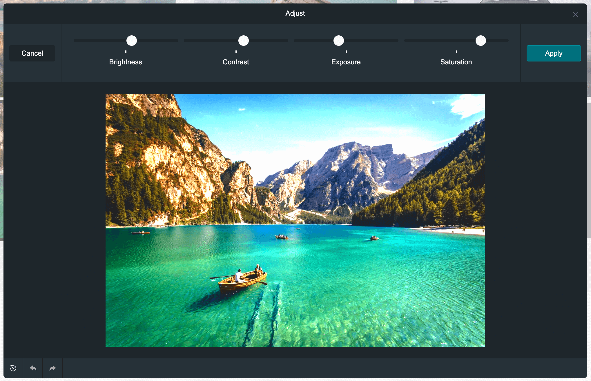
Adjust
brightness, contrast, exposure, and saturation
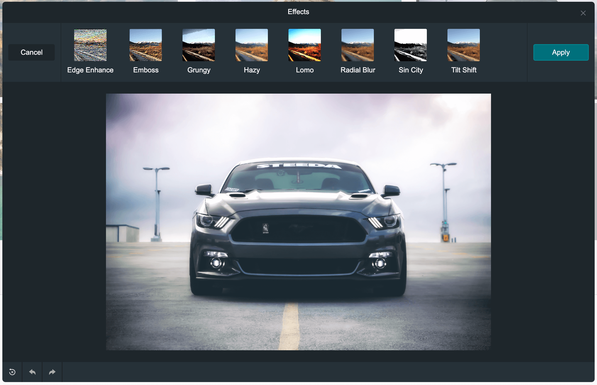
Effects
edge enhance, emboss, grungy, hazy, lomo, radial blur, sin city, tilt shift
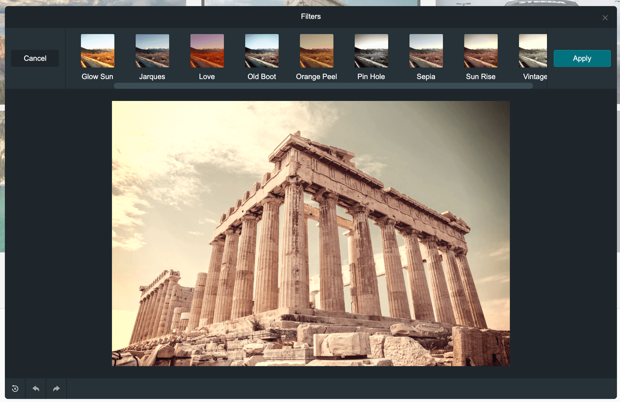
Filters
cross process, glow sun, jarques, love, old boot, orange peel, pin hole, sepia, sun rise, vintage
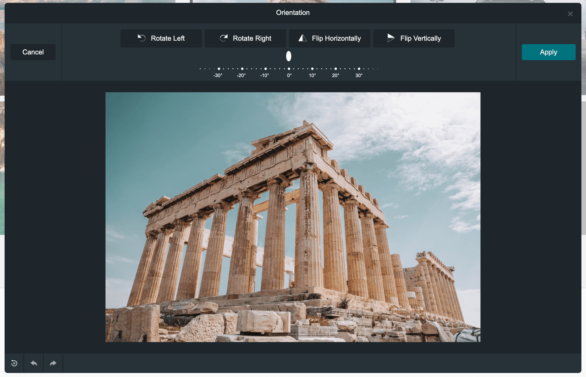
Orientation
rotate and flip (mirror effect)
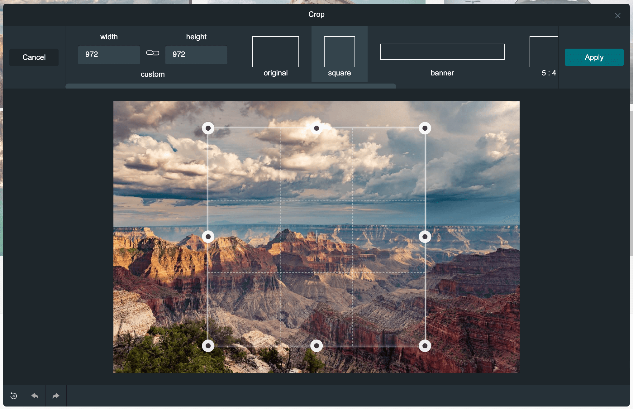
Crop
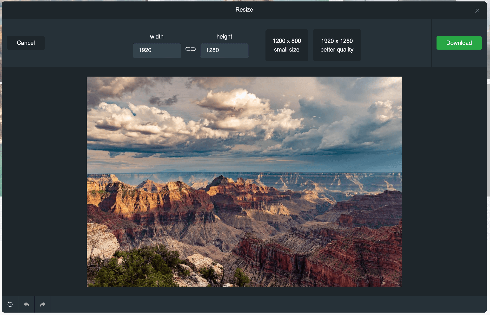
Resize
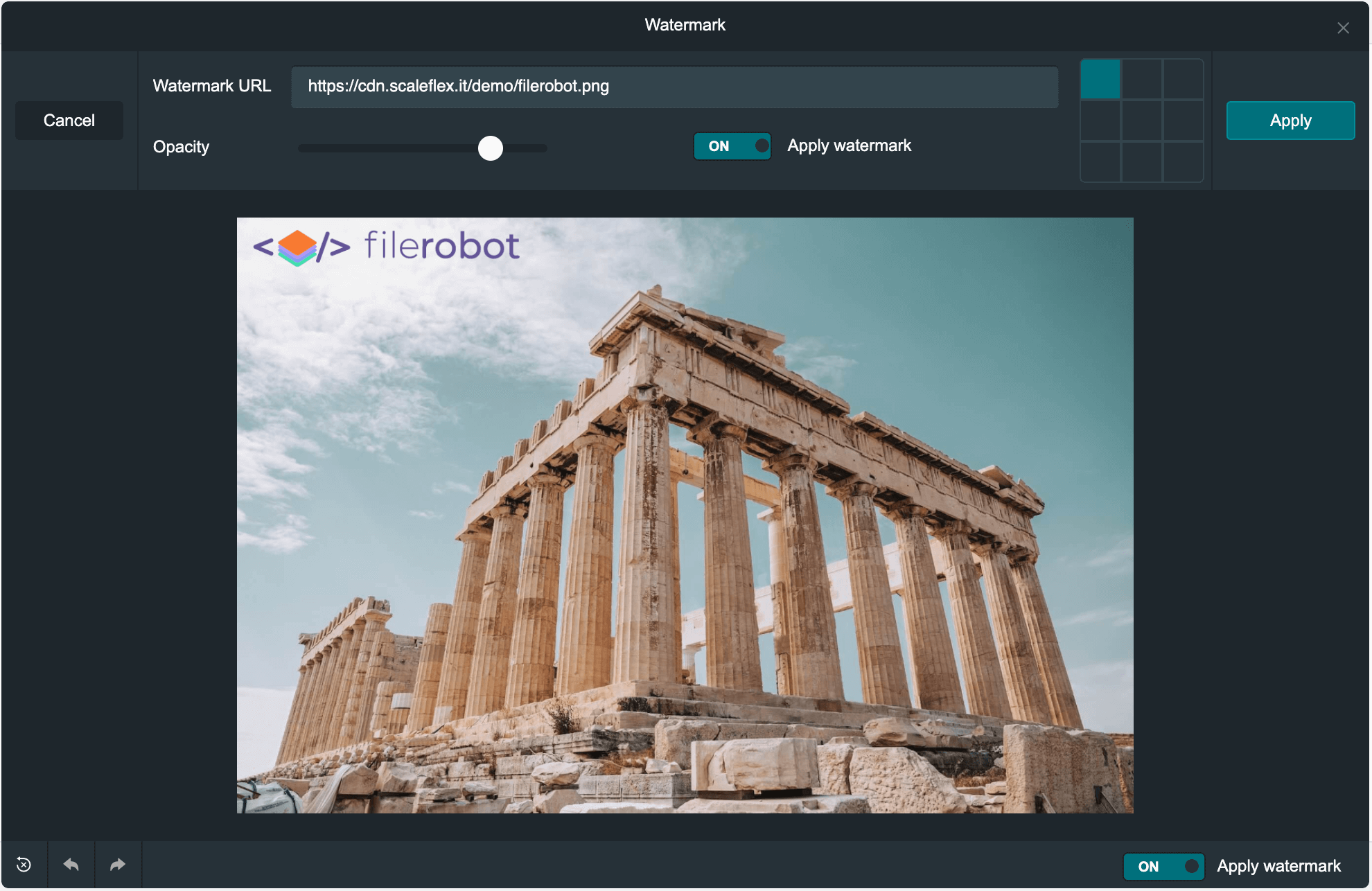
Watermark
Light theme
or use your custom color scheme
Standalone usage
Installation
Use the latest CDNized plugin version:
<script src="https://cdn.scaleflex.it/plugins/filerobot-image-editor/3.12.11/filerobot-image-editor.min.js"></script>
Quick start
We provide an easy way to integrate the image editor in your applications:
<script>
    const ImageEditor = new FilerobotImageEditor();

    ImageEditor.open('https://scaleflex.airstore.io/demo/stephen-walker-unsplash.jpg');
</script>

Methods
FilerobotImageEditor(config: {}, callbacks: {}): function
Initialization of Filerobot Image Editor plugin.
callbacks.onOpen(src: string/blob): function - triggered when modal is opened
callbacks.onBeforeComplete({ status: string, canvas: canvas element }): function - triggered before onComplete; if it returns false, it cancels the default behaviour and you can use canvas element to upload to a 3rd-party service
callbacks.onComplete(url: string, file: object): function - triggered on completion and returnes the URL of the edited image
callbacks.onClose({ status }): function - is triggered when modal is closed
status: the behavior/way the modal closed through
one of the following values would be returned depending on the case,
'close-button-clicked' => When modal is closed through clicking over the close button.
'toolbar-cancel-button-clicked' => When modal is closed through clicking over cancel button of toolbar (if shown).
'esc-key-pressed' => When modal is closed through pressing escape key.
'modal-overlay-clicked' => When modal is closed through clicking over the modal's overlay.
'image-edits-completed' => When modal is closed after finishing the edits of the image and not downloaded or uploaded.
'image-downloaded' => When modal is closed after the image is downloaded.
'image-uploaded-filerobot' => When modal is closed after uploading the image to Filerobot.
'image-uploaded-cloudimage'=> When modal is closed after uploading the image to Cloudimage.
'image-uploading-fail-filerobot' => When modal is closed after failing the uploading to Filerobot.
ImageEditor.open(url): function
Open editor modal.
url: string (required) - the URL of the image to be edited
ImageEditor.close(): function
Close editor modal.
ImageEditor.unmount(): function
Destroy the editor
React component usage
Installation
$ npm install --save filerobot-image-editor
Quick start
We provide an easy way to integrate the image editor in your applications:
import React, { useState } from 'react';
import { render } from 'react-dom';
import FilerobotImageEditor from 'filerobot-image-editor';


const App = () => {
  const src = 'https://scaleflex.airstore.io/demo/stephen-walker-unsplash.jpg';
  const [show, toggle] = useState(false);


  return (
    <div>
      <h1>Filerobot Image Editor</h1>

      <img src={src} onClick={() => { toggle(true) }} alt="example image"/>

      <FilerobotImageEditor
        show={show}
        src={src}
        onClose={() => { toggle(false) }}
      />
    </div>
  )
};

render(<App/>, document.getElementById('app'));
Methods/Properties
show: bool (required)
default: false
Trigger, to display the image editor widget.
config: object
Image editor config.
onClose(): function (required)
Callback, triggers on closing the image editor widget.
onOpen(): function (optional)
Callback, triggers on opening the image editor widget.
onComplete(): function (required)
Callback, triggers on completing processing an image.
Configuration
tools: [string]
default: ['adjust', 'effects', 'filters', 'rotate', 'crop', 'resize', 'watermark', 'shapes', 'image', 'text']
Filerobot Image Editor tools.
config.tools = ['adjust', 'effects', 'filters', 'rotate'];
isLowQualityPreview: bool
default: true
Helps to improve performance of the Image Editor by applying transformations to a low-quality preview.
config.isLowQualityPreview = true;
language: string
default: 'en'
Language of interface
available languages: en (fr, de, ru are in progress), you can add translations by yourself
config.language = 'en';
translations: object
Key/translation pairs for i18n
config.translations = {
  en: {
    'toolbar.save': 'Save',
    'toolbar.apply': 'Apply',
    ...
  }
};
reduceBeforeEdit: object
In order to improve performance when editing your images, you can reduce the image size before editing.
default: mode: 'manual', widthLimit: 2000px, heightLimit: 2000px
config.reduceBeforeEdit = {
    mode: 'manual',
    widthLimit: 2000,
    heightLimit: 2000
  };
reduceBeforeEdit.mode: string | 'manual', 'auto' - Manual mode will show a modal before editing where you can reduce size of the image. Auto mode will reduce the image in the background (saving image proportion).
reduceBeforeEdit.widthLimit: number - Limit of the image width
reduceBeforeEdit.heightLimit: number - Limit of the image height
watermark: object
Add watermark on the image after applying image transformations.
default: null
watermark.url: string - url of the logo/image
watermark.urls: [url|{ url, label }] - list of url of the logo/image preset to select from in editor
watermark.position: string | default: 'right-top'; 'right-top', 'left-top', 'center-top', 'right-top', 'left-center', 'center', 'right-center', 'left-bottom', 'center-bottom', 'right-bottom' - position of the watermark
watermark.opacity: number | [0-1] - opacity of the watermark
watermark.applyByDefault: bool - apply by default
watermark.activePositions: string - 'corners', 'star', 'center', 'top-row', 'center-row', 'bottom-row' - select a preset or apply an array with 9 positons [1,1,1,1,1,1,1,1,1]
watermark.handleOpacity: boolean - default is true, hide or show the opacity range
watermark.imageFilter: function - default is null, pass a function that gets the image resource before draw and return a manipulated image (pass some fancy filter on the watermark)
watermark.defaultText: string - the default text that would be added as a text watermark
watermark.fonts: array - the fonts that would be shown & used in text watermark
watermark.lockScaleToPercentage: number | [0, 50, 100...etc] - default is 0 (don't scale the image & don't prevent user scaling), A percentage value to use in auto scaling the watermark's image width & height with preventing the ability to resize/scale the watermark's image for the user.
example: [{ label: 'Arial', value: 'Arial' }]
config.watermark = {
    url: 'https://jolipage002-global.api.airstore.io/v1/get/_/04e725a5-8605-57d5-bf9b-b161745e7720/6d3f41ddc2c1271cb4fede2b7cc8323bec97a3c69f89fd1dd881c5bb9460d9c6.png',
    position: 'center',
    opacity: 0.7,
    defaultText: 'Filerobot.....'
  };
colorScheme: string | 'dark', 'light'
default: 'dark'
Color schemes; currently two themes are available: 'dark', 'light'. There is a possibility to create your custom theme here.
theme: object
Possibility to make your custom theme See the example here.
example:
config.theme = {
  colors: {
    primaryBg: '#1e262c',
    primaryBgHover: '#637381',
    secondaryBg: '#263138',
    secondaryBgHover: '#34444c',
    text: '#F9FAFB',
    textHover: '#fff',
    textMute: '#aaa',
    textWarn: '#f7931e',
    secondaryBgOpacity: 'rgba(0, 0, 0, 0.75)',

    border: '#161e23',
    borderLight: '#70777f'
  },
  fonts: [
    { label: 'Arial', value: 'Arial' },
    { label: 'Tahoma', value: 'Tahoma' },
    { label: 'Times New Roman', value: 'Times New Roman'},
    { label: 'Courier', value: 'Courier' },
    { label: 'Courier New', value: 'Courier New' },
    { label: 'Verdana', value: 'Verdana' }
  ]
};
cropPresets: object
Add custom crop templates. See the example here
resizePresets: object
Add custom resize templates. See the example here
beginCropArea: number | [0-1] - default: 1 (image size)
The crop area size shown/used automatically on starting crop.
minCropAreaWidth: number | default: undefined (no minimum)
The minimum size in pixels for crop area's width custom resizing, the user won't be able to resize the crop area width less than that size unless the crop area is resized through some crop preset.
minCropAreaHeight: number | default: undefined (no minimum)
The minimum size in pixels for crop area's height custom resizing, the user won't be able to resize the crop area height less than that size unless the crop area is resized through some crop preset.
showGoBackBtn: bool
default: false
Display back button all the time, duplication of cross button.
showInModal: bool
default: true
Show the editor in modal true,
or in an element of the page if the value is false in that case for JS version the value of elementId prop would be used to show the editor inside that element if the element isn't found it would be created and appended at the end of the page's body, For React version the editor would be shown in the place where the component is called.
elementId: string (JS version)
default: filerobot-image-editor (|-cloudimage (in case of using cloudimage) |-uploader (in case of using filerobot uploader)
The id used for the editor's wrapper element whether it's inside a modal or an element if it's not found on the page it's created and appended to body, please note the appending of -[cloudimage/uploader] string to filerobot-image-editor if you are using any of the services without assigning your own elementId.
noCapitalStrs: bool
default: false
Disabling the auto capitalizing of first letter of strings using (text-transform) css property
closeButtonProps: object
default: null
Customizing the top left corner close button to fit your needs example:
config.closeButtonProps = {
  label: 'Back',
  noLabel: false,
  title: 'Back to main',
  styles: "color: rgba(255, 255, 255, 0.75);",
  hoverStyles: "color: rgba(255, 255, 255, 1); text-decoration: underline;",
  beforeStyles: "color: rgba(255, 255, 255, 0.5)"
}
label: string
default: Close
The label of the button to be shown for the user.
noLabel: boolean
default: false
for choosing whether to show or hide the string label of the button.
title: string
default: Close window
The title of the button to be shown for the user when hovering the mouse on the button and leave the mouse hovered a bit.
styles: object
default: null
Styles passed to the main styles of button's styles and it must be in normal CSS format.
beforeStyles: object
default: null
Styles passed to the :before pseudo class of button's styles and it must be in normal CSS format.
hoverStyles: object
default: null
Styles passed to the :hover pseudo class of button's styles and it must be in normal CSS format.
Any other acceptable property/event to HTML span element is accepted (ex., onContextMenu ...etc).
Filerobot Integration
Upload the image in your Filerobot storage container, edit it in the Image Editor and upload the result. Deliver lightning fast over CDN.
The example of Image Editor configuration using Filerobot service can be found here.
Cloudimage Integration
Point the Image Editor to your origin image URL, edit it and deliver the result lightning fast over the Cloudimage image CDN. Limited to the Cloudimage inline transformation features.
The example of Image Editor configuration using the Cloudimage service can be found here.
Cloudimage URL params sealing
When using Cloudimage along with the Filerobot Image Editor (config.processWithCloudimage: true), additional capabilities are available. One such example is the URL parameter sealing. URL parameter sealing offers you a mechanism of encoding some or all of the URL parameters (watermarks, resizing, filters, etc.). This way, you are protecting your origin images so they cannot be delivered without the respective transformations. When sealing is configured, you will see two extra URL parameters: ci_seal (calculated hash of the protected query string) and ci_eqs (encrypted data).
Configuration for sealing:
filerobot.token: string
default: ''
The token for which URL sealing is configured and activated.
filerobot.version: string
default: ''
URL sealing is available from v7.
imageSealing.enabled: bool
default: false
imageSealing.salt: string
default: ''
The salt string is set upon configuration and is used for the encryption.
imageSealing.char_count: number
default: 10
Calculated hash (URL ci_seal parameter) length.
imageSealing.include_params: string[] | null
default: null
URL parameters to be sealed. By default (when it's null), all parameters will be sealed. Alternatively, you can set a list of parameters, for example: ['wat_url']. This way, you can freely append additional transformations to the URL (the sealed parameters cannot be overwritten).
Example:
config = {
  filerobot: {
    token: 'your-sealing-token',
    version: 'v7',
  },
  imageSealing: {
    enabled: true,
    salt: 'some-salt-str',
    char_count: 10,
    include_params: ['wat', 'wat_url', 'wat_opacity', 'wat_scale', 'wat_pad', 'wat_gravity'],
  },
}
What's on the Roadmap for the near future
Features
- Control image brightness, contrast, exposure, and saturation (done in v3.0.0)
- Bright theme, plus possibility to make your custom theme (done in v3.0.0)
- Rounds the corners of images
- Mirror images effect (done in v3.0.0)
- New filters and effects
- Load file objects and dataURLs
- Transform input images to other image formats
- Easily integrate with third party libraries
- Compress JPEG images via Optipress
- Set to preview mode to render on top of an existing image
- Watermarking (done in v3.0.0)
- Configurable resize/crop templates (done in v3.0.0)
- Correct degree of an image (done in v3.0.0)
Adapters
- Vanilla JS (done)
- React (done)
- Angular
- Vue
- Web Component
Filerobot UI Familiy
- Image Uploader
- JS Cloudimage Responsive
- JS Cloudimage 360 view
- React Cloudimage Responsive
- Angular Cloudimage Responsive
Contributing!
All contributions are super welcome!
License
Filerobot Image Editor is provided under the MIT License