README
dom-minimap
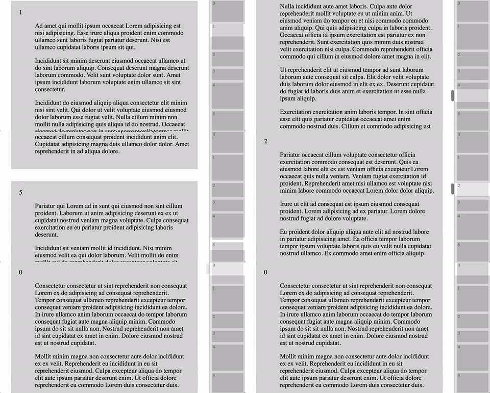
Simply lovely dom minimap
Vertical only (for now)
Use when you have looong pages and want an intuitive way to see where you are and navigate around.

Demo
- :page_facing_up: example with static html
- :steam_locomotive: example with yo-yo/choo
- :high_brightness: example with React
Usage
You can easily add minimap to existing dom structures, by hooking on to existing id, classes or adding your own.
<main id="content">
  <div class="section" data-title="1">Lorem<div>
  <div class="section" data-title="2">Ipsum<div>
  <div class="section" data-title="3">Gotsum<div>
</main>
<aside id="minimap"></aside>
const Minimap = require('dom-minimap')

var minimap = Minimap({ content: 'content', sections: 'section', title: 'data-title' })

var el = minimap()
document.getElementById('minimap').appendChild(el)

// now... call this everytime you think that your content might have changed. Its ok... its cheap.
minimap()
Options
// Defaults:
{
  content: 'minimap-content' // id of element containing sections, or the element directly
  sections: 'minimap-section' // css class used for finding sections, or a function (containerElm) => return Array(sections)
  title: 'data-section-title' // element attr containing section title, or a function (sectionElm, px-size) => return title
  tooltip: 'data-section-tooltip' // element attr containing section tooltip, or a function (sectionElm) => return tooltip
  paddingBottom: 0 // because sometimes you need more then 0.0001 px between sections, put <value>px or <value>%
}
Styling
If you want to style the minimap, you can override some of the default styles. The styles are added first in head so adding this to any of your css files should overwrite the styles.
sections:
.dom-minimap-section {
    background-color: lightgrey;
    color: grey;
    font-size: 11px;
    padding-left: 2px;
    border-radius: 2px;
    left: 5px; right: 5px;
}
.dom-minimap-section:hover {
  background-color: #e6e6e6;
}
the scroll 'hidden' overlay:
.dom-minimap-scroll {
  background-color: rgba(0,0,0,0.15);
}


