README
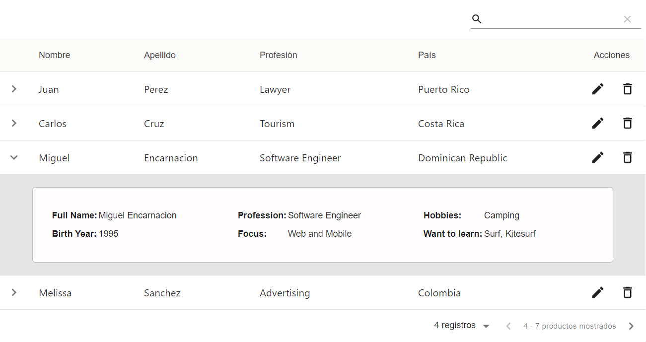
Custom DataTable React Component

How to Use:
The component expects the following props:
|Prop Name|Type|Required|Description|
|--------|----|--|---|
|columns|Array|Yes|columns must be an array of objects with the structure: { title: '', field: '' } where Title is what's shown in the column Header, and field is the name of the field needed for the Data object.|
|data|Array|Yes| data is an array of objects where the keys are called the same as the column's field, and the value can be strings or JSX elements.|
|editButton|Boolean|No|Determines if the Edit button is included|
|editFunction|Function|No|The Edit button action listener. This function receives an event and rowData parameter|
|deleteButton|Boolean|No|Determines if the Delete button is included|
|deleteFunction|Function|No|The Delete button action listener. This function receives an event and rowData parameter|
|expandPanel|Boolean|No|Determines if the Delete button is included|
|panelFunction|Function|No|The Delete button action listener. This function receives a rowData parameter|
This project was created using Material-Table and bootstrapped with Create React App.
To run in development mode, run npm start and open http://localhost:3000 to view it in the browser.