README
react-phone-number-input
International phone number <input/> for React.
This is a readme for the latest version (3.x) of the library. The previous version (2.x) readme can be found here. For migrating from 2.x to 3.x see the changelog.
Screenshots
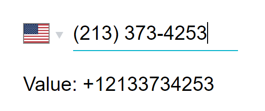
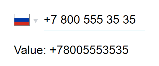
Phone number input


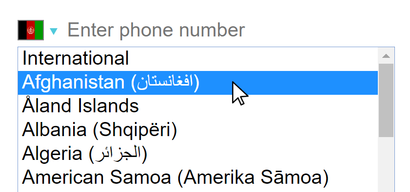
Country selection on desktop

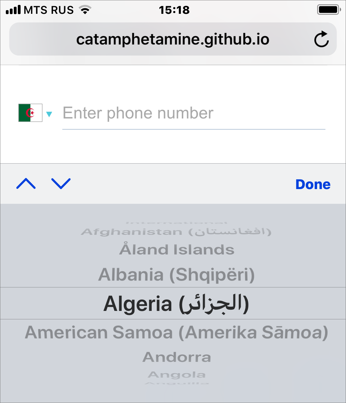
Country selection on mobile

Install
npm install react-phone-number-input --save
If you're not using a bundler then use a standalone version from a CDN.
Use
The component requires two properties: value and onChange(value).
import 'react-phone-number-input/style.css'
import PhoneInput from 'react-phone-number-input'

function Example() {
  const [value, setValue] = useState()
  return (
    <PhoneInput
      placeholder="Enter phone number"
      value={value}
      onChange={setValue}/>
  )
}
The value argument of onChange(value) function will be the parsed phone number in E.164 format. For example, if a user chooses "United States" and enters (213) 373-4253 in the input field then onChange(value) will be called with value being "+12133734253".
See the list of all available props for <PhoneInput/>. All properties not listed there will be passed through to the phone number <input/> component.
To set default country pass a defaultCountry property. Example: <PhoneInput defaultCountry="US" .../>.
To get selected country pass an onCountryChange(country) property, or use parsePhoneNumber(value) function to get country from value: parsePhoneNumber(value) && parsePhoneNumber(value).country.
To format value back to a human-readable phone number use formatPhoneNumber(value) or formatPhoneNumberIntl(value) functions.
There's also a "without country select" phone number input component available.
CSS
The styles for this component are in the style.css file. CSS class names start with .PhoneInput, and for :focus state there's .PhoneInput--focus CSS class name.
The stylesheet uses native CSS variables for easier styling. Native CSS variables work in all modern browsers, but older ones like Internet Explorer wont't support them. For compatibility with such older browsers one can use a CSS transformer like PostCSS with a "CSS custom properties" plugin like postcss-custom-properties.
An example of CSS variables:
--PhoneInputCountryFlag-height— Flag icon height.--PhoneInputCountryFlag-borderColor— Flag icon outline color.--PhoneInputCountrySelectArrow-color— Country select arrow color.--PhoneInputCountrySelectArrow-opacity— Country select arrow opacity (when not:focused).--PhoneInput-color--focus— Flag icon:focusoutline color, and also country select arrow:focuscolor.
When using Webpack
When using Webpack, include the stylesheet on a page via import:
import 'react-phone-number-input/style.css'
It is also recommended to set up something like a postcss-loader with a CSS autoprefixer or postcss-custom-properties transpiler for supporting old web browsers.
When not using Webpack
Get style.css file from this package, optionally process it with a CSS autoprefixer or postcss-custom-properties transpiler for supporting old web browsers, and then include the CSS file on a page.
<head>
  <link rel="stylesheet" href="/css/react-phone-number-input/style.css"/>
</head>
Or include the style.css file directly from a CDN.
Utility
This package exports several utility functions.
formatPhoneNumber(value: string): string
Formats value as a "local" phone number.
import { formatPhoneNumber } from 'react-phone-number-input'
formatPhoneNumber('+12133734253') === '(213) 373-4253'
formatPhoneNumberIntl(value: string): string
Formats value as an "international" phone number.
import { formatPhoneNumberIntl } from 'react-phone-number-input'
formatPhoneNumberIntl('+12133734253') === '+1 213 373 4253'
isPossiblePhoneNumber(value: string): boolean
Checks if the phone number is "possible". Only checks the phone number length, doesn't check the number digits against any regular expressions like isValidPhoneNumber() does.
import { isPossiblePhoneNumber } from 'react-phone-number-input'
isPossiblePhoneNumber('+12133734253') === true
isPossiblePhoneNumber('+19999999999') === true
isValidPhoneNumber(value: string): boolean
Validates a phone number value.
import { isValidPhoneNumber } from 'react-phone-number-input'
isValidPhoneNumber('+12133734253') === true
isValidPhoneNumber('+19999999999') === false
By default the component uses min "metadata" which results in less strict validation compared to max or mobile.
I personally don't use strict phone number validation in my projects because telephone numbering plans sometimes change and so validation rules can change too which means that isValidPhoneNumber() function may become outdated if a website isn't re-deployed regularly. If it was required to validate a phone number being input by a user, then I'd personally use something like isPossiblePhoneNumber() that just validates phone number length.
parsePhoneNumber(input: string): PhoneNumber?
Parses a PhoneNumber object from a string. This is simply an alias for parsePhoneNumberFromString() from libphonenumber-js. Can be used to get country from value.
import { parsePhoneNumber } from 'react-phone-number-input'
const phoneNumber = parsePhoneNumber('+12133734253')
if (phoneNumber) {
  phoneNumber.country === 'US'
}
getCountryCallingCode(country: string): string
This is simply an alias for getCountryCallingCode() from libphonenumber-js.
import { getCountryCallingCode } from 'react-phone-number-input'
getCountryCallingCode('US') === '1'
Flags URL
By default, all flags are linked from country-flag-icons's GitHub pages website as <img src="..."/>s. Any other flag icons could be used instead by passing a custom flagUrl property (which is "https://catamphetamine.github.io/country-flag-icons/3x2/{XX}.svg" by default) and specifying their aspect ratio via --PhoneInputCountryFlag-aspectRatio CSS variable (which is 1.5 by default, meaning "3x2" aspect ratio).
For example, using flagpack "4x3" flag icons would be as simple as:
:root {
  --PhoneInputCountryFlag-aspectRatio: 1.333;
}
<PhoneInput flagUrl="https://flag.pk/flags/4x3/{xx}.svg" .../>
A sidenote: flagpack doesn't have AC and TA flags, so the flag.pk website URL can't be used directly. Upvote the pull request that adds those two flags, or copy and host them yourself.
Include Flags
Linking flag icons as external <img/>s is only done to reduce the overall bundle size, because including all country flags in the code as inline <svg/>s would increase the bundle size by 44 kB (after gzip).
If bundle size is not an issue (for example, for a standalone non-web application, or an "intranet" application), then all country flags can be included directly in the code by passing the flags property:
import PhoneInput from 'react-phone-number-input'
import flags from 'react-phone-number-input/flags'

<PhoneInput flags={flags} .../>
Without country select
To render just a phone number input component without country <select/>:
import PhoneInput from 'react-phone-number-input/input'

function Example() {
  // `value` will be the parsed phone number in E.164 format.
  // Example: "+12133734253".
  const [value, setValue] = useState()
  // If `country` property is not passed
  // then "International" format is used.
  return (
    <PhoneInput
      country="US"
      value={value}
      onChange={setValue} />
  )
}
Receives properties:
country: string?— Ifcountryis specified then the phone number can only be input in "national" (not "international") format, and will be parsed as a phone number belonging to thecountry. Example:country="US".international: boolean?— Ifcountryis specified andinternationalproperty istruethen the phone number can only be input in "international" format for thatcountry, but without "country calling code" part. For example, ifcountryis"US"andinternationalproperty is not passed then the phone number can only be input in the "national" format forUS((213) 373-4253). But ifcountryis"US"andinternationalproperty istruethen the phone number will be input in the "international" format forUS(213 373 4253) without "country calling code" part (+1). This could be used for implementing phone number input components that show "country calling code" part before the input field and then the user can fill in the rest of their phone number in the input field.defaultCountry: string?— IfdefaultCountryis specified then the phone number can be input both in "international" format and "national" format. A phone number that's being input in "national" format will be parsed as a phone number belonging to thedefaultCountry. Example:defaultCountry="US".If neither
countrynordefaultCountryare specified then the phone number can only be input in "international" format.value: string?— Phone numbervalue. Examples:undefined,"+12133734253".onChange(value: string?)— Updates thevalue.inputComponent: component?— A custom<input/>component can be passed. In that case, it must be aReact.forwardRef()to the actual<input/>.smartCaret: boolean?— By default, the<input/>uses "smart" caret positioning. To turn that behavior off one can passsmartCaret={false}property.useNationalFormatForDefaultCountryValue: boolean?— WhendefaultCountryis defined and the initialvaluecorresponds todefaultCountry, then thevaluewill be formatted as a national phone number by default. To format the initialvalueofdefaultCountryas an international number instead setuseNationalFormatForDefaultCountryValueproperty tofalse.
See the demo for the examples.
For those who want to pass custom metadata there's react-phone-number-input/input-core subpackage.
Creating custom country <select/>
This library also exports getCountries() and getCountryCallingCode(country) functions so that a developer could construct their own custom country select. Such custom country <select/> could be used in conjunction with "without country select" input described above.
import { getCountries, getCountryCallingCode } from 'react-phone-number-input/input'
import en from 'react-phone-number-input/locale/en.json'

<select
  value={country}
  onChange={event => setCountry(event.target.value || undefined)}>
  <option value="">
    {en['ZZ']}
  </option>
  {getCountries().map((country) => (
    <option key={country} value={country}>
      {en[country]} +{getCountryCallingCode(country)}
    </option>
  ))}
</select>
See the demo for the example.
Localization
Language translations can be applied using the labels property. This component comes pre-packaged with several translations (submit pull requests for adding new language translations).
Where to get country names for any language.
Country names can be copy-pasted from github.com/umpirsky/country-list.
JSON.stringify(
  Object.keys(countries).sort()
    .reduce((all, country) => ({ ...all, [country]: countries[country] }), {}),
  null,
  '\t'
)
Also note that a country names list generated from umpirsky/country-list won't include Ascension Island (AC) and Tristan da Cunha (TA) — they will need to be added manually.
The labels format is:
{
  // Can be used as a label for country input.
  // Country `<select/>` uses this as its default `aria-label`.
  "country": "Phone number country",
  // Can be used as a label for phone number input.
  "phone": "Phone",
  // Can be used as a label for phone number extension input.
  "ext": "ext.",
  // Country names.
  "AB": "Abkhazia",
  "AC": "Ascension Island",
  ...,
  "ZZ": "International"
}
An example of using translated labels:
import ru from 'react-phone-number-input/locale/ru'

<PhoneInput ... labels={ru}/>
min vs max vs mobile
This component uses libphonenumber-js which requires choosing a "metadata" set to be used, "metadata" being a list of phone number parsing and formatting rules for all countries. The complete list of rules is huge, so libphonenumber-js provides a way to optimize bundle size by choosing between max, min, mobile and custom metadata:
max— The complete metadata set, is about140 kilobytesin size (libphonenumber-js/metadata.full.json). Choose this when you need a strict version ofisValidPhoneNumber(value)function, or if you need to get phone number type (fixed line, mobile, etc).min— (default) The smallest metadata set, is about75 kilobytesin size (libphonenumber-js/metadata.min.json). Doesn't contain regular expressions for advanced phone number validation (.isValid()) and determining phone number type (.getType()) for most countries. Some simple phone number validation via.isValid()still works (basic length check, etc), it's just that it's loose compared to the "advanced" validation (not so strict). Choose this by default: when you don't need to get phone number type (fixed line, mobile, etc), or when a non-strict version ofisValidPhoneNumber(value)function is enough.mobile— The complete metadata set for dealing with mobile numbers only, is about105 kilobytesin size (libphonenumber-js/metadata.mobile.json). Choose this when you only work with mobile numbers and a strict version ofisValidPhoneNumber(value)function is required for validating mobile numbers.
To use a particular metadata set import the component from the relevant sub-package: react-phone-number-input/max, react-phone-number-input/min or react-phone-number-input/mobile.
Importing the component directly from react-phone-number-input results in using the min metadata which means loose (non-strict) phone number validation.
Sometimes (rarely) not all countries are needed and in those cases the developers may want to generate their own "custom" metadata set. For those cases there's react-phone-number-input/core sub-package which doesn't come pre-wired with any default metadata and instead accepts the metadata as a property.
Bug reporting
If you think that the phone number parsing/formatting/validation engine malfunctions for a particular phone number then follow the bug reporting instructions in libphonenumber-js repo. Otherwise report issues in this repo.
Autocomplete
Make sure to put a <PhoneInput/> into a <form/> otherwise web-browser's "autocomplete" feature may not be working: a user will be selecting his phone number from the list but nothing will be happening.
Customizing
The <PhoneInput/> component accepts some customization properties:
inputComponent— Custom phone number<input/>component.countrySelectComponent— Custom country<select/>component.metadata— Customlibphonenumber-js"metadata".labels— Custom translation (including country names).internationalIcon— Custom "International" icon.
import PhoneInput from 'react-phone-number-input/min'

import metadata from 'libphonenumber-js/metadata.min.json'
import labels from 'react-phone-number-input/locale/en.json'

<PhoneInput
  inputComponent={...}
  countrySelectComponent={...}
  labels={labels}
  metadata={metadata}/>
All these customization properties have their default values. If some of those default values are not used, and the developer wants to reduce the bundle size a bit, then they can use the /core export instead of the default export to import a <PhoneInput/> component which doesn't include any of the default customization properties: in this case all customization properties must be passed (except for internationalIcon).
import PhoneInput from 'react-phone-number-input/core'
countrySelectComponent
React component for the country select. See CountrySelect.js for an example.
Receives properties:
name: string?— HTMLnameattribute.value: string?— The currently selected country code.onChange(value: string?)— Updates thevalue.onFocus()— Is used to toggle the--focusCSS class.onBlur()— Is used to toggle the--focusCSS class.options: object[]— The list of all selectable countries (including "International") each being an object of shape{ value: string?, label: string }.iconComponent: PropTypes.elementType— React component that renders a country icon:<Icon country={value}/>. Ifcountryisundefinedthen it renders an "International" icon.disabled: boolean?— HTMLdisabledattribute.tabIndex: (number|string)?— HTMLtabIndexattribute.className: string— CSS class name.
inputComponent
React component for the phone number input field. Is "input" by default meaning that it renders a standard DOM <input/>.
Receives properties:
value: string— The formattedvalue.onChange(event: Event)— Updates the formattedvaluefromevent.target.value.onFocus()— Is used to toggle the--focusCSS class.onBlur(event: Event)— Is used to toggle the--focusCSS class.- Other properties like
type="tel"orautoComplete="tel"that should be passed through to the DOM<input/>.
Must also use React.forwardRef() to "forward" ref to the <input/>.
CDN
One can use any npm CDN service, e.g. unpkg.com or jsdelivr.net
<!-- Default ("min" metadata). -->
<script src="https://unpkg.com/react-phone-number-input@3.x/bundle/react-phone-number-input.js"></script>

<!-- Or "max" metadata. -->
<script src="https://unpkg.com/react-phone-number-input@3.x/bundle/react-phone-number-input-max.js"></script>

<!-- Or "mobile" metadata. -->
<script src="https://unpkg.com/react-phone-number-input@3.x/bundle/react-phone-number-input-mobile.js"></script>

<!-- Styles for the component. -->
<!-- Internet Explorer requires transpiling CSS variables. -->
<link rel="stylesheet" href="https://unpkg.com/react-phone-number-input@3.x/bundle/style.css"/>

<script>
  var PhoneInput = window.PhoneInput.default
</script>
Without country select:
<!-- Without country `<select/>` ("min" metadata). -->
<script src="https://unpkg.com/react-phone-number-input@3.x/bundle/react-phone-number-input-input.js"></script>

<script>
  var PhoneInput = window.PhoneInput.default
</script>

